The Swiftype Blog / Category: Marketing

GSS is Officially Gone – Now What?


Swiftype was recently invited by leading marketing resource 
MarketingProfs to write a post highlighting the three questions organizations should ask themselves as they look to replace Google Site Search (commonly referred to as GSS).  As you likely know, April 1 was the official sunset of GSS and now users are given alternative migration options such as CSE (Google Custom Search Engine) — which will be a pared down version of GSS that features ads.

Kyle Bento of IMPACT provided a great breakdown of GSS alternatives and included this information on what you can expect from CSE.

Google Custom Search seems is very similar to GSS minus a few key features:

  • Google Custom Search is Ad-based. That means that you’ll be at the mercy of your competitor’s paid advertising, but embedded right on your site. (There’s one exception: Non-profits.)
  • There’s no option to disable Google’s branding. One of the most appealing features of GSS was the ability to remove Google’s branding and seamlessly merge results into your site. Not anymore.
  • Query limits are capped daily.  That means if you’re operating a high-volume website, Google Custom Search will stop working once you’ve hit your quota.
  • No more email support.  If you have a problem, you’re on your own.

In our article, Swiftype co-founder Matt Riley identified the three questions every org needs to consider as they choose their alternative. As Bento puts it, CSE “is not an ideal solution for professionals.” For those of you looking for a more robust solution, check out Matt’s article here (or hop on over to MarketingProfs and take a read).  

And if you’re a GSS customer and you’re ready to get started with Swiftype, you can fill out this form, and we will be in touch shortly. Alternatively, you can watch our recent webinar and learn how to migrate to Swiftype in four simple steps.

Google Site Search Is Going Has Gone Away: Three Questions to Ask Before You Replace It

Google launched Google Site Search (GSS) in 2008 to offer its technology to online publishers and their websites for searchers to use while on those sites, but the company recently announced that it will sunset GSS, forcing companies to replace its search technology by April 1, 2018.

If you are facing that decision, ask yourself three questions we’ve compiled to help you find a GSS replacement.

1) Do I need a more robust solution?

Website visitors who perform a site search are 216% more likely to convert than visitors who don’t, so it is important to ensure that those users have good experiences throughout their visit.

Furthermore, a search on your website is a strong sign of user intent, and you should be paying close attention to what the searcher is trying to find. What GSS lacks—and many alternatives offer—are customization abilities and powerful site search data and analytics, both of which provide useful ways to give marketing programs a shot of adrenaline.

Why does it matter?

Most brands that want to use content beyond purely informational purposes tend to look for some level of customization, prioritizing content based on relevancy, time, and other factors. User behavioral data is also of huge importance — especially as it relates to search — because it sheds light on what consumers want to know, what they are and aren’t finding useful, or even helping to identify customer service problem areas. Brands like SurveyMonkey have leveraged search data to build better help center content.  Deanna Horton, Senior Content Strategist for SurveyMonkey, told Forbes recently, “Listening to customers is core to who we are as a company. To make impactful data-­driven improvements to self-service content, we listen to our customers by determining what they’re writing to support about and using our findings to inform new content that answers those questions. At the end of the day, you can’t answer someone’s question if you don’t know what their question is.”

According to Horton, “[SurveyMonkey’s] product teams also leverage the data to continually improve the product experience.”

2) Will we actually use it?

New solutions are often implemented with the best of intentions but ultimately don’t get a lot of use. We’ve all done it. We’d all like to never do it again. Given website activity and content are usually highly important, brands can’t afford to let this happen with their site search technology. Be especially aware of the technical requirements a tool requires and how they match with your team’s capabilities to ensure on-going use and effective management. The pressure is on to find the right solution, use it to its full capabilities, and set the brand up to benefit from all the bells and whistles.

GSS was admittedly easy to use — and that may be suitable for some businesses — but I’m willing to bet most brands are in need of something not only more robust but also easy to use.  Alternative solutions offer easy customization and powerful analytics — with some vendors sending weekly data analytics reports that highlight problem areas or notable search trends. When deployed correctly, content management and site search can become very powerful tools for a brand to improve customer experience, content marketing, and brand loyalty.

Why does it matter?

Looking at site content with a critical operational eye ensures improved integration. Doing so will give you a sense of exactly where the solution fits, who will manage it, and clearly mark expectations.   

An added bonus: smart marketing teams will also take the opportunity to figure out how the new solution helps them work smarter and faster. With the right solution — specifically for content management and search tools — brands can build in the right data program from the start; positioning themselves for better use of the tool, improved understanding of the good, the bad and the ugly parts of their website experience, and assessing content value as it relates to other critical web metrics (click through and bounce rates, duration times, page views, etc.).  

3) How will I know it’s working?

New solutions should be judged against their effectiveness and impact on marketing goals. By finding out what metrics can be tied back directly to the new technology, marketing campaigns will be better designed to succeed. During on-boarding, actively work with your solution provider to customize a strategy for success and be clear on what metrics matter to the organization, and ask what additional metrics can be tracked.  E.g. will your conversion rates be higher? Will it accelerate pipeline? Will it save your team time spent on manual work? Will it help your team organize their day and be more productive? Will it create more engagement with customers and prospects?

Why does it matter?

If you’re going to spend the money and time building/buying and implementing a new solution, you need to know what constitutes success. MapBox, a location data platform used by mobile and app developers, and used by the likes of Doordash, Mapquest, Airbnb and Snapchat, used site search technology and data to improve online experiences.

Rafa Gutierrez, Lead Support Engineer at MapBox said, “We want to ensure a streamlined and tailored experience that gives users fast access to relevant documentation so they can make the most of their use of MapBox technology. We dive into our metrics dashboard regularly to look for oddities or patterns that give us insight to how customers are finding the info they need.”

As investment into content creation and digital marketing continue to rise, make your content not only accessible but also reconcile content with marketing’s evolving focus areas. Doing so can generate huge gains towards big-picture marketing and brand goals.

As brands transition from Google Site Search, asking these three questions may guide the decision-making process. You may confirm that you have the right solution, or be compelled to explore your options. Your goal should be to deploy a solution that allows you to inform your audiences, improve the online experience, and engage in meaningful ways.

At your service: Swiftype GSS Migration Specialists
Our GSS Migration Specialists have lots of experience with the GSS migration process (which is really simple) and we make it easy for you to get a search engine up and running by providing a web crawler and API for ingesting data, and an intuitive admin dashboard for managing your search experience.

If you have questions about migrating from GSS to Swiftype or just about site search implementations in general, feel free to email us at [email protected].

8 Ways to Improve Your Website’s Conversion Rate (for SaaS Companies)

Back to the basics: websites are for driving sales

As companies doing business online, we design our websites to educate people about our company’s product and turn them into paying customers. While our websites can certainly also serve other purposes, like engaging and upselling existing customers, generating new business is a central focus for most companies.

When it comes to actionable tactics for getting more business from your website, improving conversion rate (aka conversion rate optimization) is at the top of the list. Here are 8 ways to improve your website’s conversion rate, based on learnings here at Swiftype, findings at our friends’ companies, and lessons from the tech industry at large.

1 — A/B testing your CTAs (and testing in general)

Keeping an experimental mindset

A/B testing CTAs is a tried and true tactic for improving website conversion rate. It keeps you in an experimental mindset and helps provide a framework for creating better versions of your website from a conversion rate standpoint. If you’re a little fuzzy on the details of A/B testing, you can read about the basics here.

When you run your A/B tests, make sure you’re only testing one thing at a time so that your test results are actually meaningful (see the “8 Rules of A/B testing”). You should utilize the scientific method for deciding what to test, executing your experiment, and analyzing the findings. I recommend reading this blog post from Joey DeBruin, Feastly’s Head of Growth: “How to Run Your Growth Team Like a Scientist”. Before joining the tech industry, DeBruin worked as a scientific researcher, so he brings and interesting (and extremely rigorous) perspective to experimentation.

A/B testing in practice

An important thing to note about A/B testing is that it only works if your sample size is large enough. Here’s a tool for calculating how many unique website sessions/visits are needed for an A/B test and here’s a tool for calculating A/B test significance.

In this blog post, Kissmetrics notes, “remember to keep testing regularly, since the effectiveness of anything can change over time.” Just because you found that “Try it Now” converted better than “Start Free Trial” for a button CTA 15 months ago, does not mean that it is still the higher converting CTA. More importantly, you should be testing new CTAs against “Try it now”. I like to call it ABT (always be testing).

At Swiftype, we currently use Google Optimize for A/B testing, which lets you run 3 tests at a time for free.

2 — More video, more engagement (plus SEO benefits!)

Video draws people in

There’s a reason that Facebook altered their news feed algo to prioritize video more highly than other forms of content: it’s highly engaging. Although your website is much different than a social media platform like Facebook, people are still people and they’re generally more engaged by video than a chunk of text. People may not take the time to read all the wonderful copy you’ve written to explain your product and instead just gloss over your page. But if you happen to have a nice 1-2 minute video that clearly explains your product, you might grab their attention. Once you have someone’s attention (a very hard thing to get these days), they are significantly more likely to (a) read your wonderful copy, (b) start evaluating your product for purchase, and (c) pay you money.

SEO benefits from video

Another thing worth noting about video is that it can can help with SEO. In general, videos boost time spent on page, which is a factor in the Google search algorithm.

3 — I’d love to chat

Live chat on the Swiftype website

We mentioned live chat in our “Website Checklist: 7 Must-Have Features” and stated that:

“Customers prefer live chat over other communication options (Source: Forbes), and it actually helps companies to build trust with their website visitors.”

At Swiftype, chat has not just been a good idea in theory. It’s actually one of our highest converting channels.

Get more “at bats” with potential customers

Neil Patel references a study in his blog post about live chat that states that live chat can increase online leads by an average of 40% by among other things, helping you to lower the number of website visitors who hit your website but never indicate interest or provide you with their information. Chat is a natural and effective way to communicate with your website visitors and turn them into paying customers. Do keep in mind that you’ll need to have people available to operate the chat, and they will need to know about your products (this is especially important to keep in mind if your product is more technical like the Elastic Stack).

Looking for a live chat software? Check out Olark, Intercom, or Drift.

4 — Site search (because it converts and provides you with actionable data)

Website visitors who utilize your search bar are high intent

Of course, we have to promote our own product, but site search is truly a helpful tool for boosting your website conversion rate. I actually recently answered a Quora question about site search and conversion rate noting that for websites that have a search bar, 30% of their visitors will perform a search. What’s even more interesting is that visitors who perform a search are over 200% more likely to convert than those who don’t. Although the research report which contains these findings (which I found on Kissmetrics) is more focused on ecommerce, it still carries over to other verticals and industries at varying levels of conversion.

Site search is a flexible interface and source of actionable data

At the very least, searchers are high intent and they’re providing you with actionable data such as things that they’re interested in that are not currently on your website (determined by our popular queries with no results metric). Search is a flexible interface for you to serve up the right content for a large range of potential customers. If you implement site search with a powerful backend that returns relevant results and an intuitive UI, chances are that you’ll see a lift in your conversion rate.

Getting started with site search

Ready to get started with Swiftype Site Search? You can sign up for a 14-day free trial here and watch a quick product overview here.

Also don’t miss: “Site search is your marketing website’s killer feature

5 — When less is more

Giving website visitors more options is not always better (and can be worse)

When we’re building our landing pages, sometimes we get carried away and include too many sections, too many icons, and too many CTAs. We want our website visitors to understand all the intricacies of our products and have options for “learning more” but sometimes we forget that providing more options is not always better.

I’m not saying that short pages are better than long pages (that more depends on your unique business – more on this here), but that your page should be highly focused and drive a given visitor to complete 1 or a few different tasks.

The paradox of choice

Although Barry Schwartz’s paradox of choice theory may not hold true in all cases, in general, too much choice can be overwhelming/paralyzing — especially in the case of web pages with limited surface area. Not familiar with the paradox of choice? Watch this TED talk.

6 — The price is right (pricing pages)

Pricing page structure

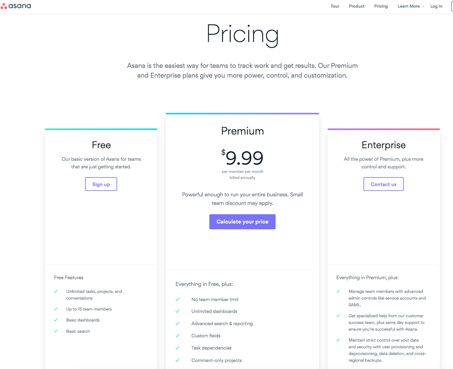
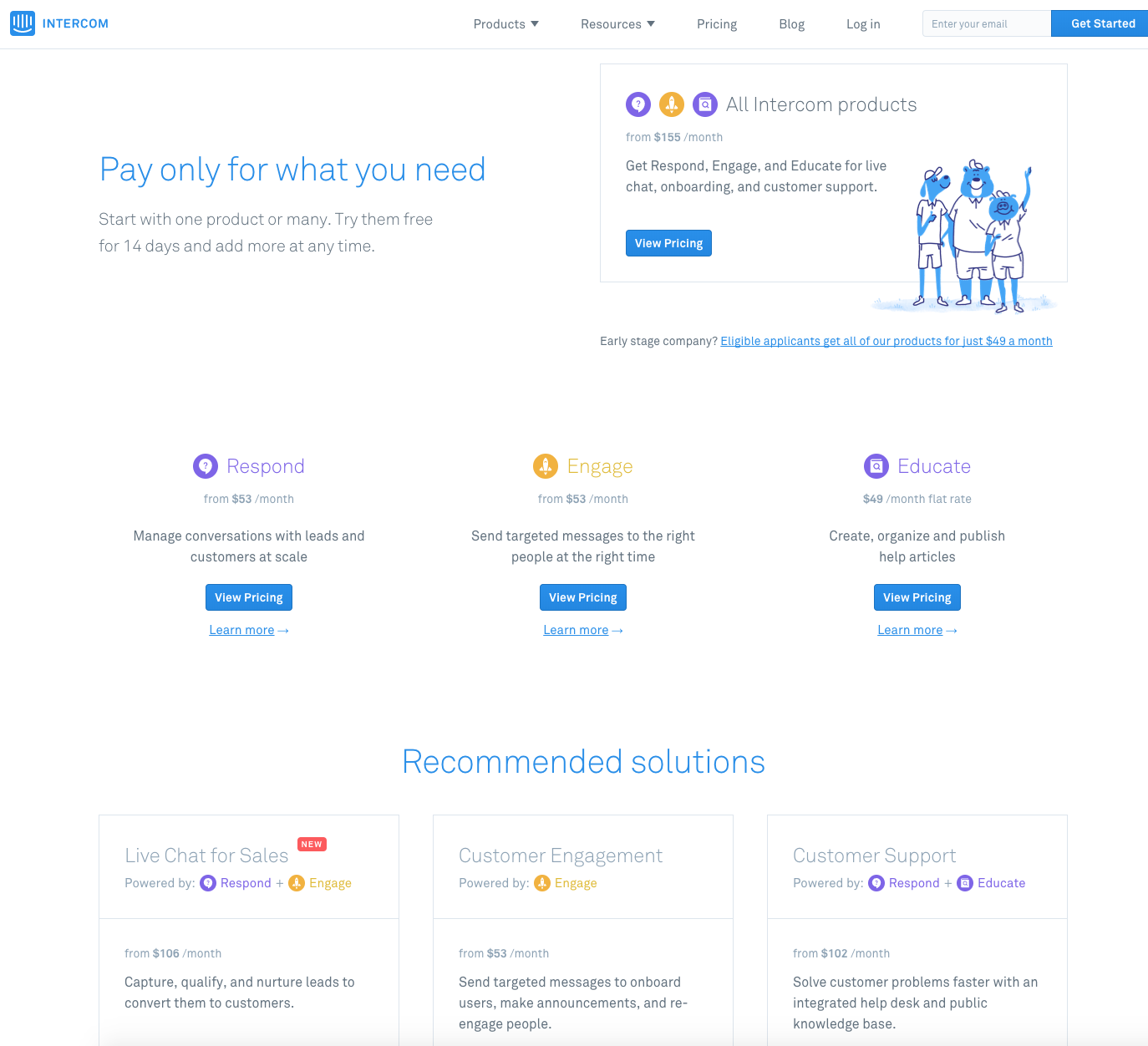
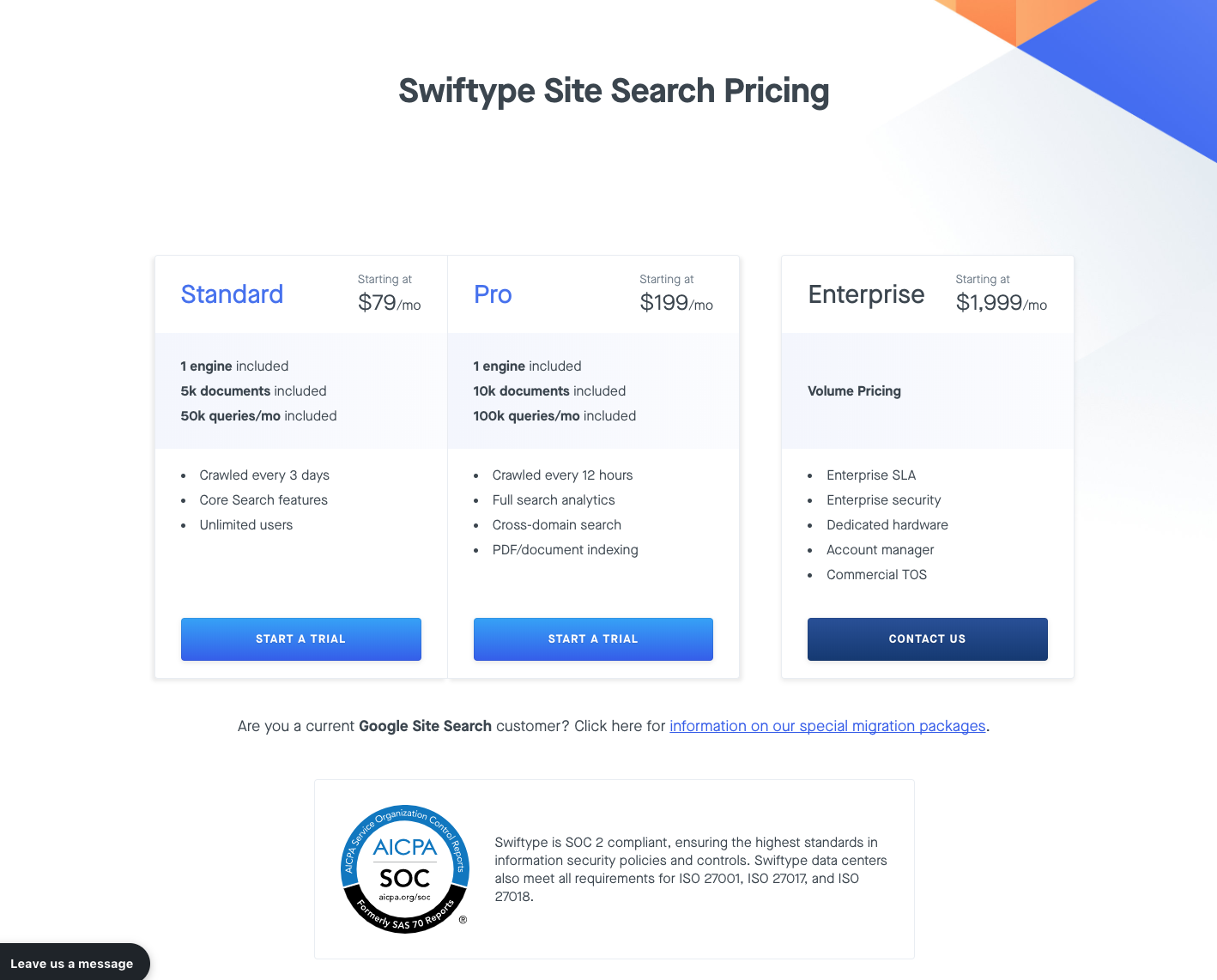
For SaaS companies, the typical pricing page has columns with pricing tiers, usually ranging from free (sign up now) to enterprise (contact us for pricing/schedule a demo). Since website visitors tend to check out your pricing page before they decide to pay you, the structure of the page is important, to say the least. Let’s take a look at the pricing pages for three SaaS companies/products: Asana, Intercom, and Swiftype.

  • Asana — Asana has heavily simplified the header on their pricing page and keeps their header, and website for that matter, simple throughout. Under the “Pricing” h1, Asana has a short paragraph that reminds you (a) what Asana is and (b) why you might want to pay for it rather than use the free version. In the large center column (Premium version), Asana has a purple button with the text “Calculate your price”. If you click this button it prompts you to sign into the app. This is an interesting CTA and Asana is likely using this tactic because they found that this softer CTA actually converts better than something like “Buy Now”.

  • IntercomIntercom’s pricing page has to serve a different purpose than Asana and Swiftype’s pricing pages. Since Intercom now offers three products (Respond, Engage, Educate), they need to provide pricing information on all three products without overwhelming a visitor. I think they do a good job of this, and I’m a fan of their “Recommended solutions” section which shows how you might want to combine their products to solve business problems. It’s a great example of reducing complexity/cognitive load.

  • SwiftypeThe Swiftype pricing page features three tiers of pricing, with the two lower priced tiers in a single rectangle and then the Enterprise plan in a rectangle by itself. The Pro and Enterprise plan briefly note some of the additional things you’re getting by paying more and if you scroll down you’ll see this detailed comparison chart. One thing that I think we’ve done well with this page is including our SOC 2 compliance badge which promotes trust and reliability.

7 — Navigation structure and recognizing that people do click footer links

Carefully consider the links you include in your navigation bar

Navigation bars are important to a website visitor’s (especially a first time visitor) experience on your website. A clean navigation bar that features links to the things you know your potential customers care about — product pages, pricing, documentation, customer stories, etc. — will lead your website visitor to the promised land. A convoluted nav bar will lead them to your competitor’s website.

I don’t think there’s any one size fits all advice with nav bars other than including links you know are important to educating leads and converting them. You can figure out what those links are by tracking clicks with UTMs and by using heatmap tools like Hotjar or Crazy Egg. You can also learn about what on your website converts by conducting surveys and talking to your customers.

People click our footer and they probably click yours too

While only about 19% of visitors to our home page scroll to the footer, those that do are often looking for specific information and they will click on footer links to try and find it. 

More specifically, people click on the “See Pricing →” link in our footer which is a good sign of intent to purchase. In fact, 1.42% of all clicks on our homepage are on this link which is a significant number of clicks based on our visitor and click volume on this page.

In short, don’t neglect your footer as it can be a real source of business. Design your footer with purpose, test what links and text you include, and you could see a lift in your overall conversion rate.

8 — Flaunt that customer validation

Let your customers do the talking

Your customers’ opinions, recommendations, and thoughts about your company are worth significantly more to your buyers than anything that you say about your product.

Logos — If you have customers that are willing to let you use their logo on your website, you should absolutely do it as it helps build trust, especially with bigger companies. In a way, this is a form of show don’t tell in the sense that you’re not saying why you’re awesome but just showing how your awesomeness is currently manifesting itself in the market.

This customer logo banner is from Asana’s pricing page. Airbnb, Uber, Lyft, Nasa? Either this product provides value or these highly sophisticated companies/organizations like wasting money on useless software.

Customer Quotes — Customer quotes, in a similar manner to case studies, help visitors to get a feel for the problems your product solves from a real end user’s standpoint. Everyone is going to say their own product is great; when there are other businesses saying that a product is worth using, then it just sounds more credible.

Go forth and convert

Focus your energy

Hopefully you were able to get some helpful ideas from this post. While you might be excited to go try all of 8 them, I recommend choosing 1-2 and really focusing in on them. These tactics do work but you might not see the success you should if you spread yourself too thin.

Constant experimentation

Furthermore, it’s possible that you’ve tried some of these tactics and experienced varying levels of success and/or failure with them. As I mentioned in the section about A/B testing, the effectiveness of your conversion strategies will constantly be changing and you should keep testing your current set up as well as experimenting with new ideas.

Swiftype 2017 year in review

You can say 2017 was an eventful year for Swiftype. From starting the year with a product launch of Swiftype Enterprise Search, to helping countless customers migrate from their discontinued Google Site Search solutions, to joining forces with Elastic, the makers of popular open source products such as Elasticsearch, Kibana, Beats, and Logstash. To celebrate the new year, here’s a look back at the top blog posts of 2017.

1 — Swiftype Joins Forces with Elastic

“We are thrilled today to announce that Swiftype is joining forces with Elastic, the makers of Elasticsearch. This new alliance will accelerate the development of new features and tools that will make it easier for you to manage and deploy world-class search functionality to your website or organization.”

We’ve built some great search products at Swiftype over the past 5 years, but honestly, we are just getting started. Joining forces with Elastic enables us to partner with the best search experts in the world, so we can continue to innovate and deliver an increasingly diverse suite of powerful search solutions.

2 – Google Site Search is Sunsetting: What to Expect and How to Move On

“By now you’ve probably heard that Google plans to sunset Google Site Search (GSS) and direct existing customers to use their free replacement, the Google Custom Search Engine (CSE). Unfortunately for these customers, the CSE forces websites to show ads alongside their search results, so the transition isn’t as simple as it may seem. As the dominant alternative to GSS for the past 4 years, we at Swiftype are very familiar with the migration process, and we’re happy to share some of our advice to those weighing their options.”

In early 2017, Google announced it was sunsetting their widely used Site Search product. Since Swiftype Site Search is similar to GSS in its ease of use and out-of-the-box relevancy, many former Google customers turned to us for their website search needs.

3 — Customers Say It Best

“Each month, nearly 900,000 buyers utilize G2 Crowd for unbiased user reviews to assess which products are best for their businesses. Swiftype’s reviews on G2 Crowd both reaffirm the value of our product to our customers, and allow us to improve our products to make sure each and every user is satisfied with their site search.”

When potential Swiftype customers are evaluating our solution, we really encourage them to do a free trial and spend some time using our product. We believe in our product and consistent positive product reviews from our customers help to reaffirm that belief.

4 — Introducing AI-Powered Enterprise Search

“Today, we’re excited to announce a new product that addresses this problem head-on: Swiftype Enterprise Search. By integrating artificial intelligence with our industry leading search technology, Swiftype Enterprise Search is a powerful new way for employees to seamlessly access the data they need, from any device, across the many applications their jobs require.”

Earlier this year, we launched Swiftype Enterprise Search  — a modern, AI-powered search solution that enables companies to unify content from all of their apps and data stores. Our enterprise search solution is available on web, desktop and mobile and integrates with your existing workflows so you can find the files you need without breaking your concentration.

5 — 10 Examples of Well-Designed Search UIs

“Are you implementing search and looking for some inspiration? In general, intuitive search UI designs are easy to access, match the look and feel of the overall website, and offer autocomplete results and filters when appropriate. To give you a better idea, here are 10 examples of well-designed search UIs.”

At Swiftype, we’ve helped thousands of businesses to index their content, customize their search engines and then implement search interfaces on their website, either with our JavaScript snippet or our search and autocomplete jQuery libraries. Over the years, we’ve learned what makes for a good search experience and can confidently tell you that these 10 companies have nailed their search UIs — helping them to get the full value of their search technology and enabling their customers to easily find what they need.

6 — How Asana, Twilio, and SurveyMonkey optimized their customer support centers [Infographic]

“Asana, Twilio, and SurveyMonkey have all invested heavily in creating high-quality support content. To ensure this content is easily accessible, these companies leverage advanced search technology that provides relevant results to their customers and actionable analytics for them.”

One big use case for our search technology is in customer support centers. Companies like those listed above utilize Swiftype Search as a flexible portal for their customers to access their support documentation. Since search is a natural way for people to access a wide array of support content, our customers have been very successful in reducing their manual support loads while simultaneously helping their customers to resolve their issues more quickly.

7  — How site search makes higher education websites more accessible

“When a website visitor elects to use the search bar on your website, they have a specific goal in mind, so it’s important to provide them with relevant search results. At Swiftype, we specialize in building relevant site search technology and making it incredibly easy to set up on your website. We’re fortunate to be able to work with some great universities, and we wanted to highlight their Swiftype success stories.”

University websites generally have lots of pages designed to cater to a diverse constituency of prospective students, current students, faculty, staff and parents. Powerful search technology like Swiftype helps higher education institutions to improve the accessibility of their websites so that their site visitors can find the content that’s relevant to them.

8 — Great Developers Ship, They Don’t Configure Search

“Engineers and developers want to spend more time developing products and websites, not configuring search. It’s pretty obvious, and understandable. Developing allows them to be creative, solve problems, and build new things. Search, albeit a critical feature for site visitors, is part of a site’s foundation. It should already be there. And it should work, and work well.”

As you can imagine, we love to build search products at Swiftype and can tell you that they’re difficult to get right. When you’re working on a product or website and need search functionality, you may not have the time or resources to allocate towards building search. And that’s where we come in with our robust search as a service solution and well-documented developer APIs.

9 — Welcome to the Swiftype office in San Francisco [HQ Photo Tour]

“Welcome to Swiftype Headquarters in San Francisco, California. Founders Matt Riley and Quin Hoxie have created a comfortable and fun office environment with an open floor plan, scattered lounges, and various collaborative areas. Take a look at our office photos below to experience a day in the life of a Swiftype team member.”

Take a tour of the Swiftype/Elastic San Francisco Office and get a feel for what it’s like to work at a high-growth startup.

10 — Swiftype API overview: Customize your search engine

“The Swiftype API gives you full control over the schema of your search engine and the content that you index. With the Swiftype API endpoints, you are able to index data, execute search queries, and access rich analytics.”

One of our main focuses for the Swiftype Site Search product is to make it extremely easy to get your data indexed so you can quickly install a working search bar. Some of our customers prefer to interact with Swiftype through our API or client libraries which enables them to build search to their exact specifications, from the data ingestion process to user interface design.

Test drive Swiftype Site Search

At Swiftype, we provide powerful search as a service complete with customizable search UIs. We make it easy for you to get a search engine up and running by providing a web crawler and API for ingesting data, and an intuitive admin dashboard for managing your search experience. Ready to get started with Swiftype? Sign up for your 14-day free trial here.

Holiday Website Checklist: 7 Must-Have Features

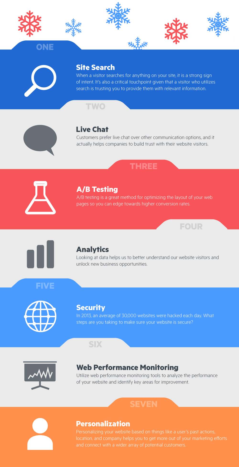
Welcome to the Holiday Website Checklist! The holiday season is a great time of year to relax, celebrate, and reflect on the ups and downs of the past year. While we don’t want you spending too much time working this holiday, we did want to give you a helpful list for reviewing the technology you use on your website for things like security, analytics, and customer communication. We’ve created a high-level infographic as well as a detailed list which you can find below. After reviewing this list, we hope you can move into the new year with some ideas for creating an even stronger web presence.

Download Infographic

1 — Site Search

When a visitor searches for anything on your website, it is a strong sign of intent. It’s also a critical touchpoint given that a visitor who utilizes search is trusting you to provide them with relevant information. While we may be biased, site search is at the top of our holiday wishlist because it’s an often underrated website feature that helps you to better engage your visitors. In addition, it’s a real-time source of actionable data that informs you of what your visitors are interested in and will help you to better recognize trends in their behavior. Looking to add site search or level up your existing installation? You can sign up for a 14-day free trial of Swiftype Site Search here or learn more here.

2 — Live Chat

Customers prefer live chat over other communication options (Source: Forbes), and it actually helps companies to build trust with their website visitors. It makes sense if you think about it as chat is a natural means of communication and it makes people feel valued that your company is there to speak with them. Over the past few years, live chat has exploded in popularity as the tools have improved and companies have realized the financial benefits of implementing chat. If you’re looking for a live chat tool, check out Olark, Intercom, or Drift.

3 — A/B testing

A/B testing is a great method for optimizing the layout of your web pages so you can edge towards higher conversion rates. Tools like Optimizely and Google Optimize provide a robust framework for rapidly conducting tests so you can iterate on your website design. If you’re new to A/B testing and not sure where to start, check out this blog post from Kissmetrics.

4 — Analytics

Looking at data helps us to better understand our website visitors and unlock new business opportunities. You’re likely already using Google Analytics or a similar tool to track things like social referrals, traffic, and conversions. If you’re looking to utilize some of the more advanced features of Google Analytics, check out this course from Google. Heatmap tools like Hotjar are another great source of insight — helping you to understand what elements of your website are working and what needs to be changed.

5 — Security

In 2013, an average of 30,000 websites were hacked each day (Source: Forbes). What steps can you take to make sure your website is secure? If you’ve built your own website, you’ll want to use a tool like Gemnasium to monitor your website for security vulnerabilities (you don’t want to be the next Equifax). Additionally, if you’re not currently using HTTPS across your website, it’s probably a good idea to switch over. This article from Creative Bloq has some great tips about how to handle things like passwords, SQL injections, and file uploads as well as a list of helpful website security tools.

6 — Web performance monitoring

Google searches the entire web in a fraction of a second, so it makes sense that people expect your website to be fast. You can use tools like Pingdom or Uptrends to analyze the performance of your website and identify key areas for improvement. Additionally, Google has a free tool called PageSpeed which analyzes your site’s performance and offer recommendations for improving it. Overall, improving your site’s performance is an easy win as it’s relatively simple to identify problem areas and make the necessary changes.

7 — Personalization

Why serve up a generic web page when you can tailor your content on a visitor-by-visitor basis? Personalizing your website based on things like a user’s past actions, location, and company helps you to get more out of your marketing efforts and connect with a wider array of potential customers. If you’re using Marketo for marketing automation, they have a web personalization solution. If you’re using another marketing automation system, many of them offer personalization options and there are also some vertical-specific tools which you can read about here.

Hopefully, you found this list helpful and came away with some new ideas to think about as we head into the new year. From all of us at Swiftype and Elastic, we wish you a happy holiday!

How to add advanced search to WordPress and other CMS’s

Businesses need advanced search for their CMS’s

Content management systems (CMS’s) like WordPress and HubSpot make it easy to create and manage content including landing pages, blog posts, and other types of media. In general, CMS’s provide a robust platform that can be implemented with much less technical expertise than a system built in-house.

Navigating CMS’s with lots of content

CMS’s are great platforms for enabling you to create and publish content, but they can become difficult for visitors to navigate once you have published a lot of content.

Take a moment to think about how website visitors land on your site and how they navigate around once they are there. If a visitor didn’t come to your site by directly entering your URL in their web browser, they probably found your content through social media or a Google search.

Once a visitor consumes the content that they originally visited your website for, are they able to easily find other relevant content pieces? It’s likely that you have a header or sidebar menu for the visitor to find additional content but do you also have a search box?

If you have advanced search implemented on your website, visitors have a single window into all of your content.

Site search keeps visitors on your site and gives you insight about their interests

It’s important to have a search box on your CMS website because visitors who utilize in-site search are high intent. They trust your website enough to explicitly search for content, and they’re expecting relevant results. If you have advanced search implemented on your website, visitors have a single window into all of your content.

Additionally, site search provides you with rich analytics including popular queries, queries that return no results, and CTRs. After reviewing your search analytics, you can optimize your search results and add new content based on queries that are returning no results.

Gain full control over your CMS search

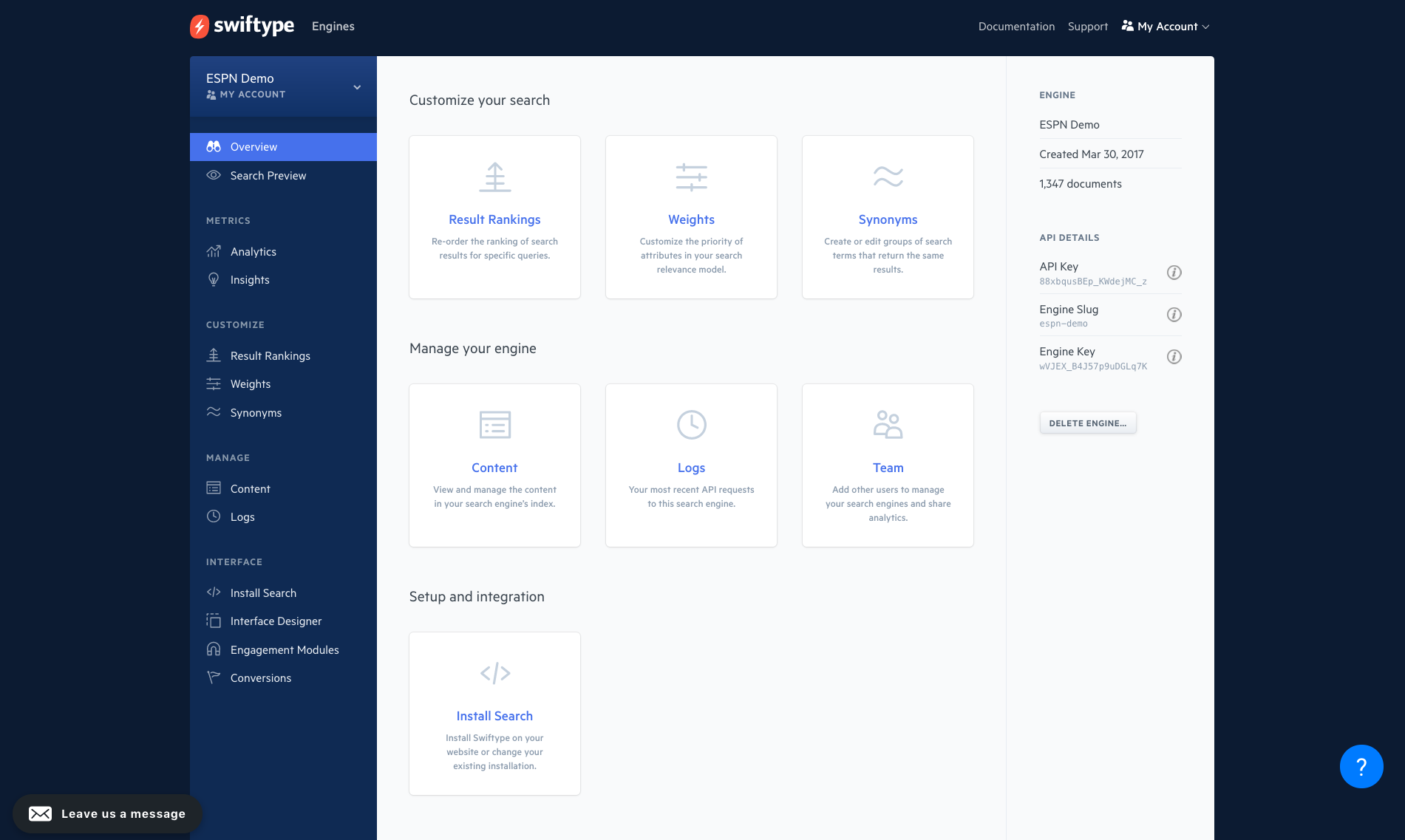
If you’re using out-of-the-box CMS search, your site search might be delivering relevant results. Unfortunately, if it’s not, there’s not much you can do to fine-tune the results. On the other hand, if you add Swiftype Site Search to your CMS, you will have full control over your search experience including the ability to weight certain data fields, re-rank results on a query-by-query basis, and set synonyms.

Swiftype Admin Dashboard

Adding Swiftype Site Search to any CMS

You can use the Swiftype web crawler or API to index your content and make it searchable on your website. If you elect to use the Swiftype web crawler, you can easily optimize content extraction with HTML tags. If you elect to use the Swiftype API to index your data, you will create a search engine schema that makes sense for the data you want to make searchable.

To implement a search UI on your website, you can use the Swiftype Embed Code or our jQuery libraries.

Adding Swiftype Site Search to WordPress (via a plugin)

The Swiftype Site Search WordPress plugin replaces the standard WordPress search with a better, more relevant search engine. It is used by many of the largest WordPress sites (including TechCrunch) and has over 3,000 active installs. 

The Swiftype Site Search plugin doesn’t require coding and takes a minute to install. Swiftype uses the WordPress search results template, so you have total control over the design.

To get started, just create a Swiftype account, copy your API key and paste it into the Swiftype WordPress Plugin. Then you click a button and Swiftype will index your WordPress site. For more advanced use cases, Swiftype supports the WP-CLI.

Additional resources:

Search Quiz: How much do you know about search history and technology?

Search is playing an increasingly important role in our lives. Much of the world’s knowledge is now on the internet and search is the technology that unlocks that content, making it accessible with the stroke of a few keys. Here are a few data points about the growing volume of search queries and internet content.

  • Google handles about 63,000 searches per second (Source)
  • In 2016, Google handled 2 trillion searches, up nearly 70% from the year before (Source)
  • Researchers estimate that there are about 1 billion websites and 4.66 billion web pages (Source)
  • There was about 81.8 million WordPress blog posts published last month, a 27% increase from the previous year. (Source)

As the amount of information on the internet continues to grow, search researchers and companies will continue to innovate, leveraging technologies like AI to make search even more intuitive and relevant.

Swiftype Search Quiz: Top scorers get a t-shirt

At Swiftype, we like to think we know a thing or two about search, so we created a Search History and Technology Quiz. From the name of the first search engine to some of the key search algorithms, this quiz is a chance to test out your search knowledge.

How much do you know about search? Take the quiz here.


If you score in the top 10 percentile on the quiz, we will send you a free Swiftype t-shirt.

*Limit to one entry per participant during the contest period. Contest ends on Oct 31, 2017. Winners will be notified by email.

Site search is your marketing website’s killer feature

A visitor lands on your site. Now what?

Congrats, you’ve succeeded in driving a prospective customer to your website. Although most first time visitors to your site are not ready to buy (approximately 96%), you have a huge opportunity to educate them and create a future buyer.

Now that you have someone on your website, you need to make sure they can quickly understand what your product does and whether it is relevant to them. As for navigating your website, this new visitor will likely take 1 of 3 actions:

  • Click a link on your navigation bar
  • Click a CTA on the page they landed on
  • Go to your search bar and enter exactly what they’re looking for

As a marketer, you want to make sure you think through each of these customer journeys. According to Aberdeen Group, 39% of marketers say that promotion and discovery of content is a top challenge. No doubt, it can be difficult to show the right content at the right time to push a potential lead down the funnel so every bit of effort spent improving your conversion rate is worth it.

Website visitors who utilize site search

Here at Swiftype, we think a lot about search, so I’d like to really focus on the third customer pathway that I highlighted: when a customer decides to use your search bar. Over the past 15 years, Google’s powerful search engine has made searching second nature for many people and other leading tech companies like Amazon and Facebook are centering their products around search.

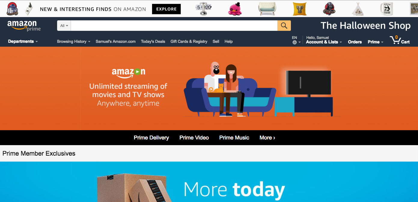
Amazon’s website prominently features search


Search done well is an extremely flexible and intuitive way to navigate a product or website, and it’s also a huge source of valuable data that can, among other things, signal macro trends and help companies to improve user experience.

Site search for marketing websites

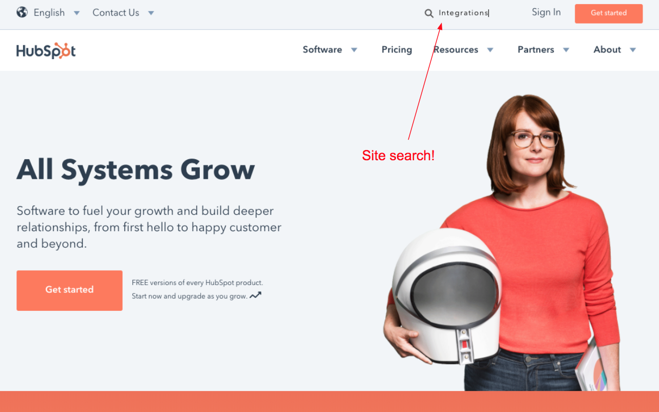
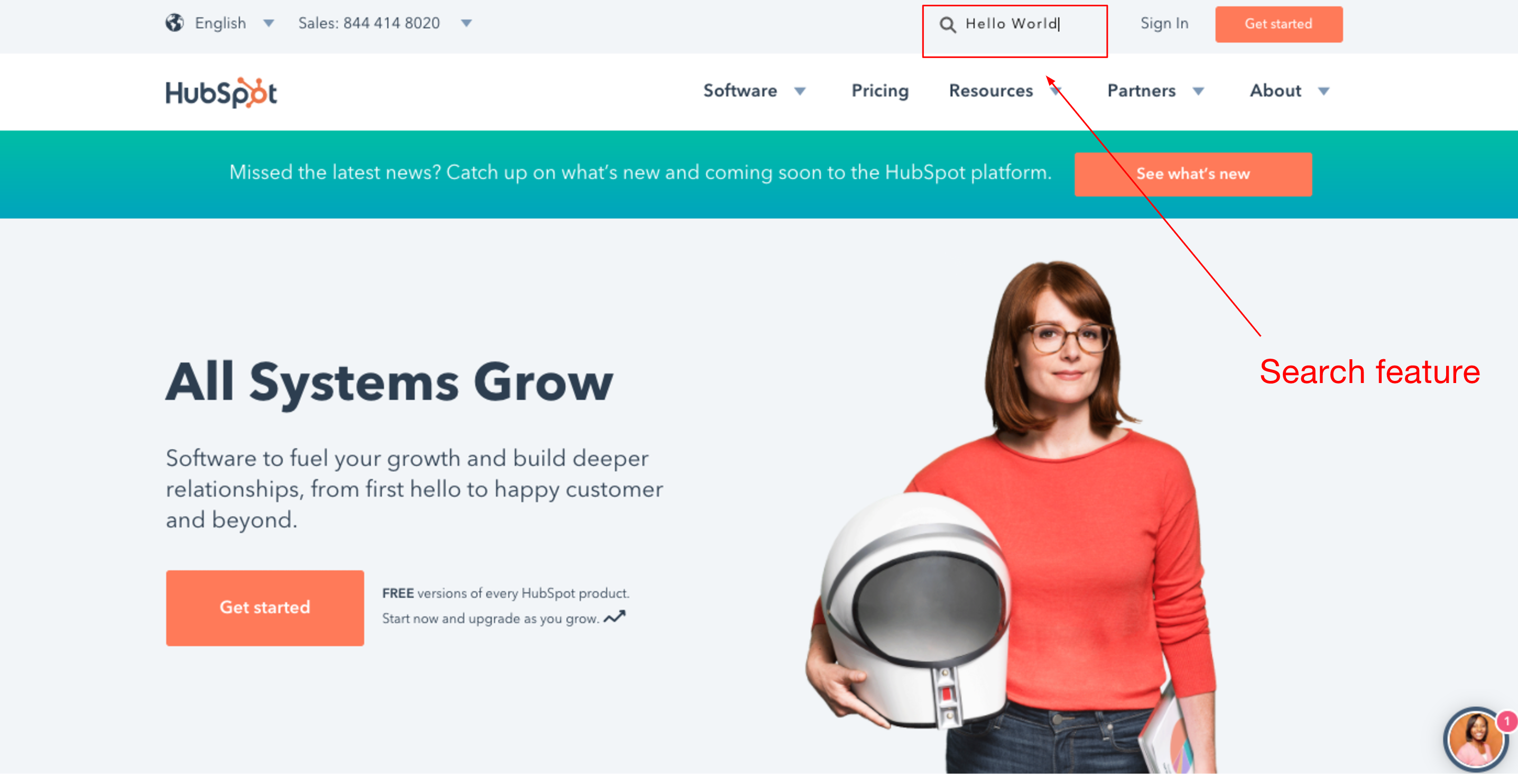
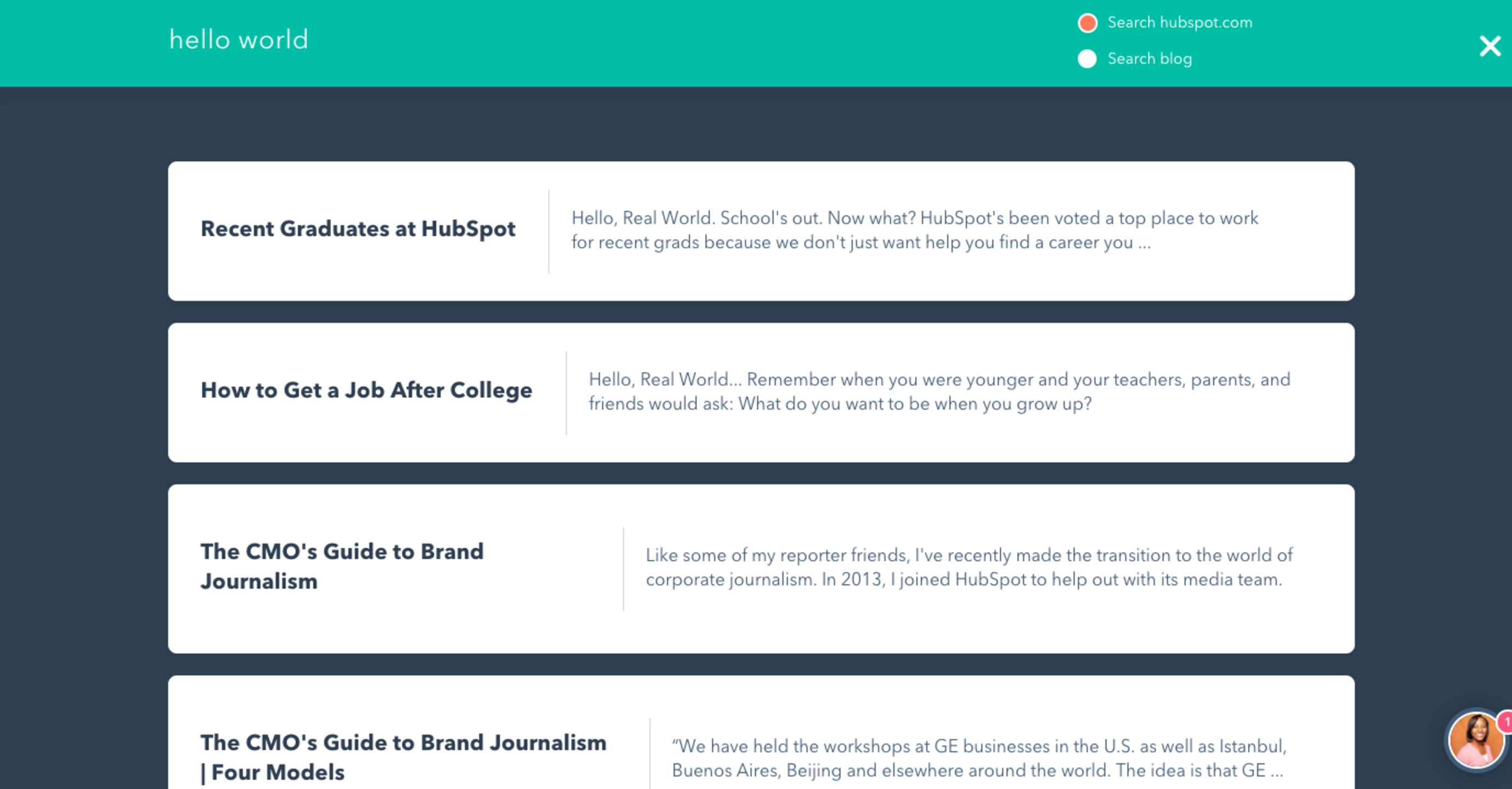
As for companies that do search well on their marketing websites, let’s take a look at HubSpot’s website. HubSpot is a B2B SaaS company that builds marketing and sales software primarily for SMBs. They are well known for their effective inbound marketing strategies, and they’ve done a great job with their marketing website, including the site search feature.

HubSpot Marketing Website Homepage


Search Results Page


It’s clear that HubSpot has made sure that the experience for website visitors who want to utilize search is optimized. And for good reason.

Website visitors who perform a search are 216% more likely to convert than visitors who don’t.

Why is site search so important?

Website visitors who perform a search are 216% more likely to convert than visitors who don’t. When a visitor searches for anything on your website, it is a strong sign of intent. For one, you know they’re interested enough in your product to try and learn more and two, you know exactly what they are searching for.

When visitors utilize search on your website, you want to make sure they can easily find what they’re looking for. If they can’t, they will use Google to search your site at which point you will lose all control of your potential customer’s journey. If one of your competitors outranks you on Google for certain topics, it’s likely that your new website visitor will end up on your competitor’s website.

The benefits of great site search

Aside from helping your website visitors to find what they’re looking for, site search is also a great source of actionable data. You can use search analytics to determine:

  • Volume of search queries
  • Popular search queries
  • Queries returning no results
  • CTRs on search results

There is a LOT you can do with this information. At Swiftype, one big way we’ve seen our customers utilize search analytics is for data-driven content development. They look at what their website visitors are searching for that is returning no results, and then they create content to fill those voids.

By pinning their highest converting content to the top of the search results for relevant queries, companies can boost conversions and ultimately increase revenue.

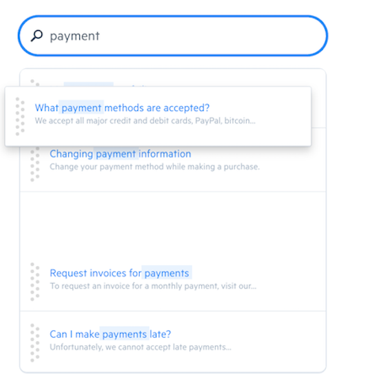
Since the Swiftype Site Search Solution features a drag-and-drop interface for ranking results on a query-by-query basis, it’s easy for companies to make changes, and they have full control over their site search experience. The drag-and-drop interface also makes it easy for companies to optimize their search conversion rates for popular queries. By pinning their highest converting content to the top of the search results for relevant queries, companies can boost conversions and ultimately increase revenue.

Drag-and-drop interface for ranking results


Getting started with Swiftype Site Search

To get started with Swiftype, you just enter your website’s address and Swiftype will index your site and create your search engine in real-time. No coding is required, but developers can use the API for extra control. Swiftype can index any amount of content and new content is indexed automatically, so your search is always up-to-date.

A free trial makes trying Swiftype risk-free

Want to try out Swiftype Site Search for your website? You can sign up for a free trial here.

Mobile Search and the Modern Marketer

“Mobile mobile mobile!” No, this isn’t an episode of The Brady Bunch—it’s the rallying cry of marketers everywhere. Why? Because in 2016, mobile overtook desktop as the primary way users accessed web content. Of course, if you take a look around the next time you’re in a mall, restaurant, on public transit, or attending a sporting event—probably even in your own living room—this won’t come as a huge surprise.

According to a January 2017 report, time spent in mobile applications climbed by 69% in the United States alone. U.S. users spend an incredible five hours each day using apps on their mobile devices, with messaging and social media in particular eating up a large chunk of that time.

Not only are web users mobile and in love with their apps, they also tend to be multi-platform users, switching from desktop to laptop, to tablet, to mobile phones, (which is why omni-channel marketing is so important).  

Problems to Contemplate When Considering Mobile

Clearly, it would behoove most organizations to have mobile marketing—specifically as it relates to mobile search—squarely in their crosshairs. But, like most things in life, mobile isn’t 100% perfect. There are definitely some mobile-specific issues that you need to take into consideration when crafting your mobile strategy.

  • The potential for higher latency. We have all been spoiled by our rapid-fire desktops and having to wait for a site to load turns a lot of visitors off. I can personally attest to the fact that I bounce if something is taking too long to load and I know I’m not alone. In fact, if a page doesn’t load within three seconds… POOF! 53% of mobile site visits are abandoned. And when mobile sites were compared, those that loaded within five seconds (versus as long as 19 seconds) saw increased ad views, had searchers remain on site 70% longer, and decreased bounce rates by 35%.
  • Errant clicks sink ships. Similar to latency issues, you can also blame the desktop for this mobile problem. Instead of mouse clicks, keyboard strokes, and trackpad precision, it’s our clumsy thumbs and fingers poking around mobile sites. Poorly placed banners, ads, or hard-to-find search elements can lead to incorrect clicks, which lead to increased drop-off. The result? You might have just lost an engaged user on your site to your competitor.
  • Search must be simple. While you don’t want to immediately hammer visitors over the head with your search options, you must ensure that your mobile search capabilities are up front and crystal clear. Since real estate on mobile is limited, it’s especially important that the search results that the user wants are at the top of the list—otherwise users will have to scroll, potentially encouraging them to check out other sites. This means autocomplete takes on an even more important responsibility and misspellings still need to lead a user to the right place.

What Marketers Need to Know About Mobile Search

Mobile’s popularity and continued growth has definitely upset the traditional ideological mantra of: “build (and optimize) your website, and they will come.” Today, many companies—including behemoths like Google and Apple—are opting for a mobile-first push when it comes to website design.

The reasons behind a mobile-first strategy are pretty straightforward. Mobile screens (and their functionality) are fundamentally different from desktop screens and their design should reflect that. Add that to that the fact that people tend to browse more on desktops and search more on mobile, and the need for an easy and efficient mobile search experience makes perfect sense.

Also, as mentioned above, people are spoiled these days. Mobile users are highly goal-oriented, want to achieve results quickly and easily, and don’t want to encounter confusing navigation or crowded screens full of touch-sensitive elements. Not surprisingly, according to a report on SearchEngineLand.com, some of the most common (and most annoying) issues for mobile search users hunting content, also happen to match perfectly with these mobile search issues:

  • Content not sized to screen: Scroll scroll scroll.
  • Font size too small: Pinch pinch pinch.
  • Touch elements too close together: Bounce bounce bounce (see above re: errant clicks).

Adapting to the Evolution of Mobile Users

When you add up all the moving parts around mobile search, you wouldn’t be far off the mark to think that mobile hasn’t actually changed search as much as mobile users have changed search. And these days, the user/customer/client holds all the cards. To sum up, you can help mobile users achieve optimum mobile search success in a few ways:

  • If possible, adopt a mobile-first strategy.
  • Ensure that users can search immediately to find the content they are looking for.
  • Implement advanced search functionality like autocomplete, spelling correction, phrase matching, and more.
  • Do as much as you can to reduce latency.
  • Provide highly targeted content so users find what they need as quickly as possible.
  • And remember micro-moments on the user’s journey, like “I want to know, go, do, and buy.”

It’s predicted that customer/user experience will be the top brand differentiator—topping price and product—by the year 2020. If it’s not already, fine-tuning your mobile search experience should be at the top of your priority list.

Ready to take a hard look at your site search solution and how you can improve your mobile and website search? Chat with the Swiftype team today and they can help find the best fit for you.

Site Search: Your Online ROI Answer Button

As a marketer, you’re aware of all the traditional lead generation channels as well as the latest up-and-coming trends. You might even consider yourself an early-adopting, marketing maverick since you’re open to trying the latest technology or strategies that give your campaigns some edge. But with all the options out there, nothing beats the black and white facts of customer need and intent.

Your website’s search box is the ultimate window to your customer’s intentions. When a visitor takes the effort to go to your website or application’s search box and enter in a search term, it reveals not just what they’re looking for, but a higher level of interest and willingness to take action. These queries can also reveal important information about what content you’re missing or synonymous terms you should be adopting to ensure your visitors are getting the most relevant content.

Site search and search data are important and valuable components of your website, and yet, many companies don’t optimize, test, or reassess their site search at all. This is a major missed opportunity for any marketer.

Don’t miss this chance

Join us on Wednesday, May 24th for a live webinar featuring Praveena Khatri, Vice President of Marketing at Swiftype, Lukasz Zelezny, Head of Organic Acquisition at uSwitch.com, and Thorin McGee, Editor in Chief/Content Director at Target Marketing to learn how you can make the most of your own site search.

  • Mine your search for lead generation and SEO insights
  • Test and optimize your site search function
  • Convert more site search users into buyers
  • And more!

Register and save your spot today!

Site Search Data: A Goldmine of Analytics

In 2009, Google’s Avinash Kaushik wrote about the importance of site search analytics, going so far as calling them “life altering”. At that time, Kaushik argued that two major sites were driving users towards search bars: Amazon, because of it’s massive selection, and Google, because of how many users begin browsing with a global Google search. Because these sites have such a powerful influence over users’ expectations, Kaushik pointed out that more and more people “ignore our lovingly crafted navigational elements and jump to the site search box,” when they arrive on a website – a trend which generates invaluable data about user intent for site owners.

analytics

Eight years later, these websites have only grown in importance, meaning that Kaushik’s argument is even more important and more relevant than ever before. This begs the question: given this steady stream of incoming data, what analytics should site owners look for from their search bars? Although the answer to this question will vary based on the specific use case of your website, here are some of the key questions that your site search analytics should help you answer:

  1. What are the most common queries? This seems obvious, but site owners should pay close attention to their top queries because they offer a looking glass into the precise wants and needs of site visitors. Queries are, after all, user generated, so they allow you to listen to your users in a way that no other analytics can.
  2. What are users searching for but not finding? In other words, what are the most common queries that return no results? This data is highly actionable, since you can either create content to meet these users’ needs or reconfigure your results to provide answers and prevent users from hitting dead ends.
  3. What percentage of site visitors are using search? How often is search used relative to the navigation buttons? Aside from helping you get a clear sense of just how valuable search navigation is for users, you should track this statistic over time to see user behavior patterns change in response to any updates you make on your website.
  4. How do conversion rates differ for searchers vs. non-searchers? If your analytics tell you that users who perform searches are more likely to convert than users who don’t, you should reconfigure your website to feature search as a more prominent navigational tool.
  5. What pages are users searching from most? This will give you a sense of what pages are most confusing. It’s a safe assumption that if a user can’t find the information that they are looking for on a certain page, they will use the search bar to try and find it.
  6. What autocomplete options are most popular? When a user chooses an item from the autocomplete dropdown, this is a clear indication of what they are hoping to find for that query. Use this data to customize search results and autocomplete display so that these results are closer to the top.

When you configure your website’s analytics, make sure you’re getting all this information. As we stated above, internal search bars provide a unique opportunity to directly listen to your users – and this valuable information should not go to waste.

If you’d like to learn more about site search analytics, read Swiftype’s white paper: Understanding Site Search Analytics, which provides industry benchmarks on important metrics and offers A/B testing ideas to optimize search for conversions.

Subscribe to our blog