Back to the basics: websites are for driving sales
As companies doing business online, we design our websites to educate people about our company’s product and turn them into paying customers. While our websites can certainly also serve other purposes, like engaging and upselling existing customers, generating new business is a central focus for most companies.
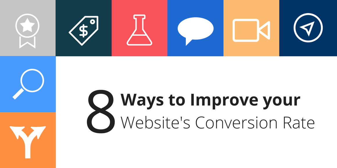
When it comes to actionable tactics for getting more business from your website, improving conversion rate (aka conversion rate optimization) is at the top of the list. Here are 8 ways to improve your website’s conversion rate, based on learnings here at Swiftype, findings at our friends’ companies, and lessons from the tech industry at large.
1 — A/B testing your CTAs (and testing in general)
Keeping an experimental mindset
A/B testing CTAs is a tried and true tactic for improving website conversion rate. It keeps you in an experimental mindset and helps provide a framework for creating better versions of your website from a conversion rate standpoint. If you’re a little fuzzy on the details of A/B testing, you can read about the basics here.
When you run your A/B tests, make sure you’re only testing one thing at a time so that your test results are actually meaningful (see the “8 Rules of A/B testing”). You should utilize the scientific method for deciding what to test, executing your experiment, and analyzing the findings. I recommend reading this blog post from Joey DeBruin, Feastly’s Head of Growth: “How to Run Your Growth Team Like a Scientist”. Before joining the tech industry, DeBruin worked as a scientific researcher, so he brings and interesting (and extremely rigorous) perspective to experimentation.
A/B testing in practice
An important thing to note about A/B testing is that it only works if your sample size is large enough. Here’s a tool for calculating how many unique website sessions/visits are needed for an A/B test and here’s a tool for calculating A/B test significance.
In this blog post, Kissmetrics notes, “remember to keep testing regularly, since the effectiveness of anything can change over time.” Just because you found that “Try it Now” converted better than “Start Free Trial” for a button CTA 15 months ago, does not mean that it is still the higher converting CTA. More importantly, you should be testing new CTAs against “Try it now”. I like to call it ABT (always be testing).
At Swiftype, we currently use Google Optimize for A/B testing, which lets you run 3 tests at a time for free.
2 — More video, more engagement (plus SEO benefits!)
Video draws people in
There’s a reason that Facebook altered their news feed algo to prioritize video more highly than other forms of content: it’s highly engaging. Although your website is much different than a social media platform like Facebook, people are still people and they’re generally more engaged by video than a chunk of text. People may not take the time to read all the wonderful copy you’ve written to explain your product and instead just gloss over your page. But if you happen to have a nice 1-2 minute video that clearly explains your product, you might grab their attention. Once you have someone’s attention (a very hard thing to get these days), they are significantly more likely to (a) read your wonderful copy, (b) start evaluating your product for purchase, and (c) pay you money.
SEO benefits from video
Another thing worth noting about video is that it can can help with SEO. In general, videos boost time spent on page, which is a factor in the Google search algorithm.
3 — I’d love to chat
Live chat on the Swiftype website
We mentioned live chat in our “Website Checklist: 7 Must-Have Features” and stated that:
“Customers prefer live chat over other communication options (Source: Forbes), and it actually helps companies to build trust with their website visitors.”
At Swiftype, chat has not just been a good idea in theory. It’s actually one of our highest converting channels.
Get more “at bats” with potential customers
Neil Patel references a study in his blog post about live chat that states that live chat can increase online leads by an average of 40% by among other things, helping you to lower the number of website visitors who hit your website but never indicate interest or provide you with their information. Chat is a natural and effective way to communicate with your website visitors and turn them into paying customers. Do keep in mind that you’ll need to have people available to operate the chat, and they will need to know about your products (this is especially important to keep in mind if your product is more technical like the Elastic Stack).
Looking for a live chat software? Check out Olark, Intercom, or Drift.
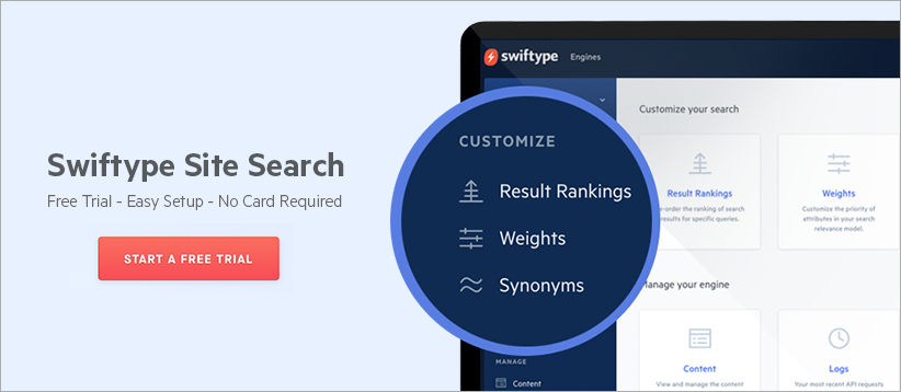
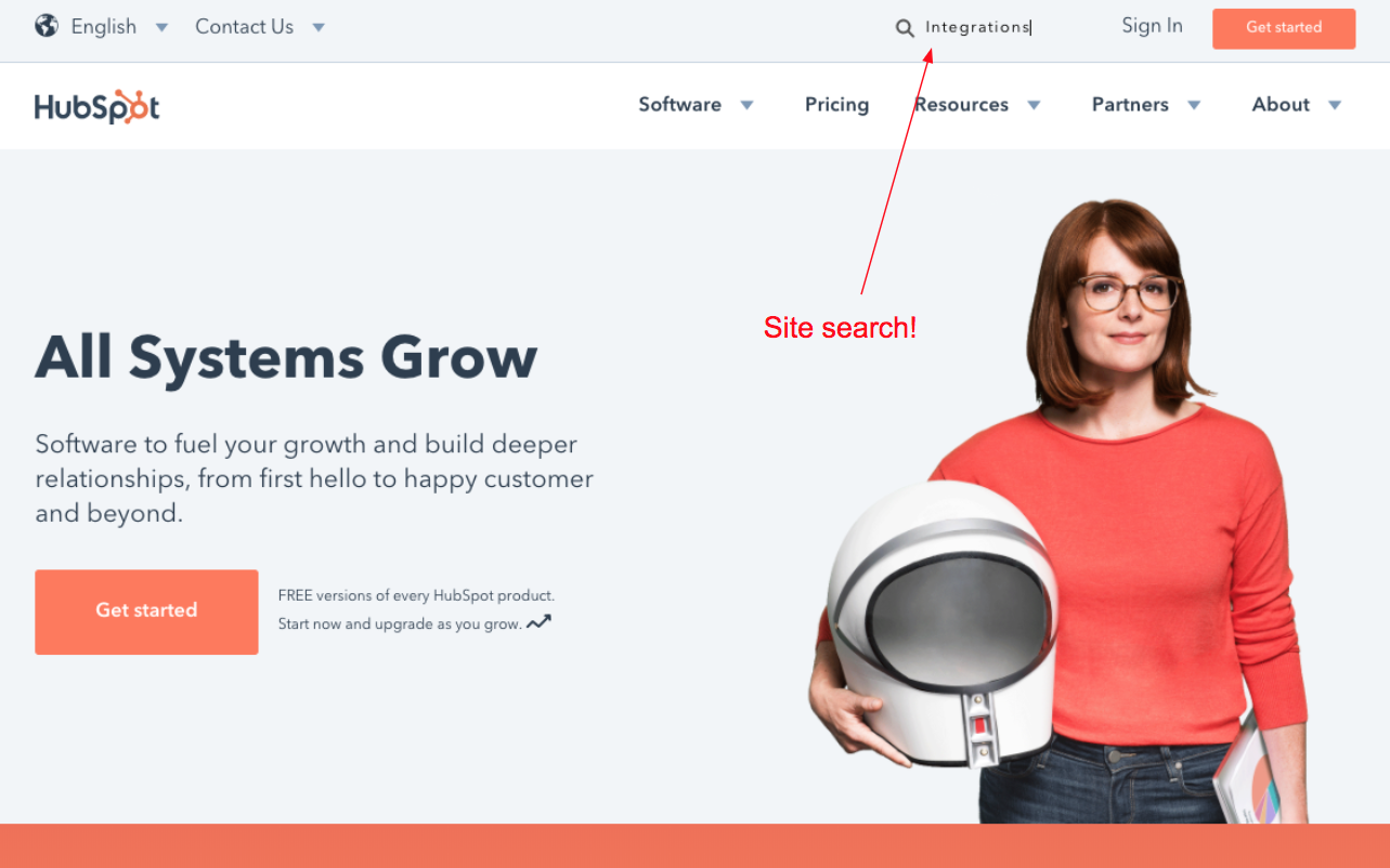
4 — Site search (because it converts and provides you with actionable data)
Website visitors who utilize your search bar are high intent
Of course, we have to promote our own product, but site search is truly a helpful tool for boosting your website conversion rate. I actually recently answered a Quora question about site search and conversion rate noting that for websites that have a search bar, 30% of their visitors will perform a search. What’s even more interesting is that visitors who perform a search are over 200% more likely to convert than those who don’t. Although the research report which contains these findings (which I found on Kissmetrics) is more focused on ecommerce, it still carries over to other verticals and industries at varying levels of conversion.
Site search is a flexible interface and source of actionable data
At the very least, searchers are high intent and they’re providing you with actionable data such as things that they’re interested in that are not currently on your website (determined by our popular queries with no results metric). Search is a flexible interface for you to serve up the right content for a large range of potential customers. If you implement site search with a powerful backend that returns relevant results and an intuitive UI, chances are that you’ll see a lift in your conversion rate.
Getting started with site search
Ready to get started with Swiftype Site Search? You can sign up for a 14-day free trial here and watch a quick product overview here.
Also don’t miss: “Site search is your marketing website’s killer feature”
5 — When less is more
Giving website visitors more options is not always better (and can be worse)
When we’re building our landing pages, sometimes we get carried away and include too many sections, too many icons, and too many CTAs. We want our website visitors to understand all the intricacies of our products and have options for “learning more” but sometimes we forget that providing more options is not always better.
I’m not saying that short pages are better than long pages (that more depends on your unique business – more on this here), but that your page should be highly focused and drive a given visitor to complete 1 or a few different tasks.
The paradox of choice
Although Barry Schwartz’s paradox of choice theory may not hold true in all cases, in general, too much choice can be overwhelming/paralyzing — especially in the case of web pages with limited surface area. Not familiar with the paradox of choice? Watch this TED talk.
6 — The price is right (pricing pages)
Pricing page structure
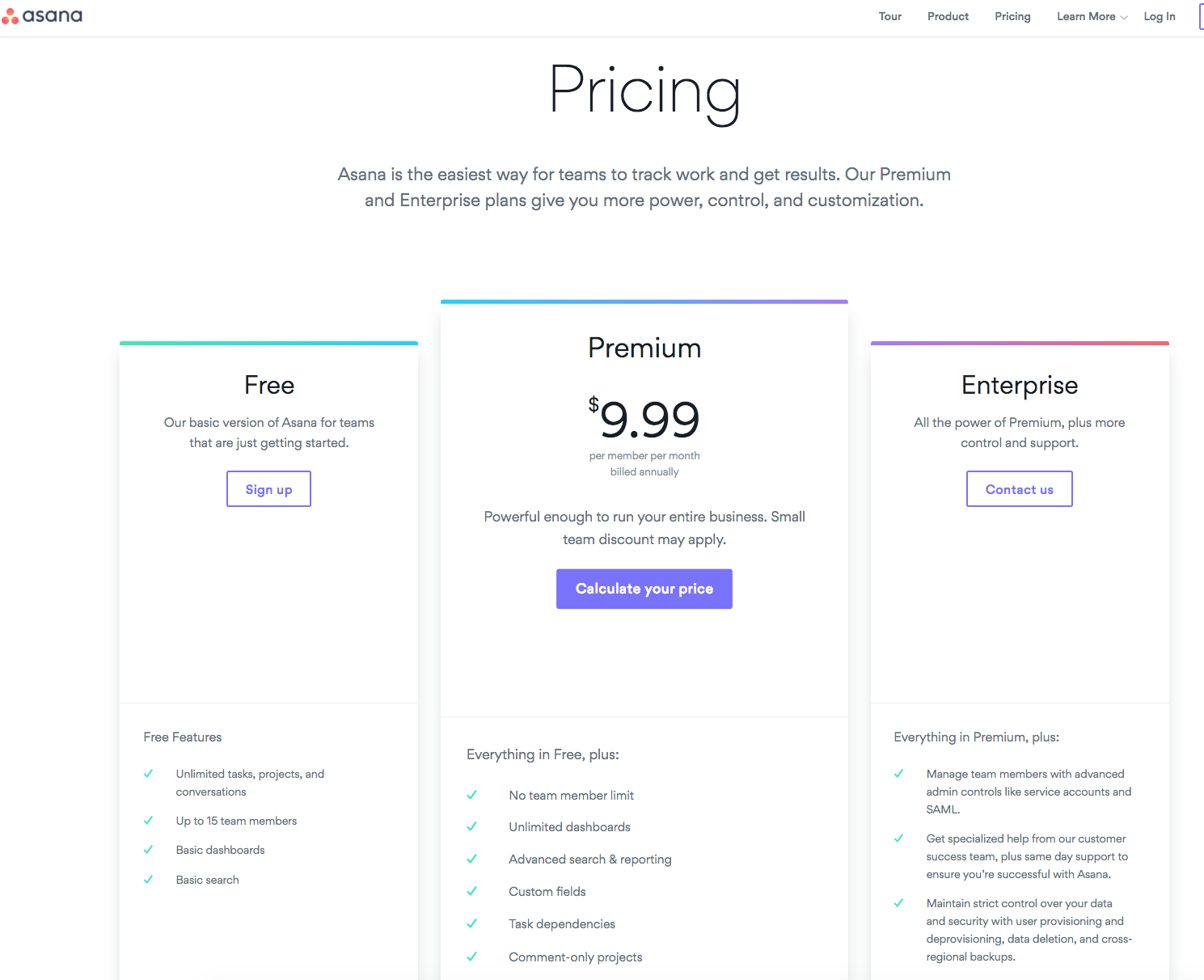
For SaaS companies, the typical pricing page has columns with pricing tiers, usually ranging from free (sign up now) to enterprise (contact us for pricing/schedule a demo). Since website visitors tend to check out your pricing page before they decide to pay you, the structure of the page is important, to say the least. Let’s take a look at the pricing pages for three SaaS companies/products: Asana, Intercom, and Swiftype.
- Asana — Asana has heavily simplified the header on their pricing page and keeps their header, and website for that matter, simple throughout. Under the “Pricing” h1, Asana has a short paragraph that reminds you (a) what Asana is and (b) why you might want to pay for it rather than use the free version. In the large center column (Premium version), Asana has a purple button with the text “Calculate your price”. If you click this button it prompts you to sign into the app. This is an interesting CTA and Asana is likely using this tactic because they found that this softer CTA actually converts better than something like “Buy Now”.
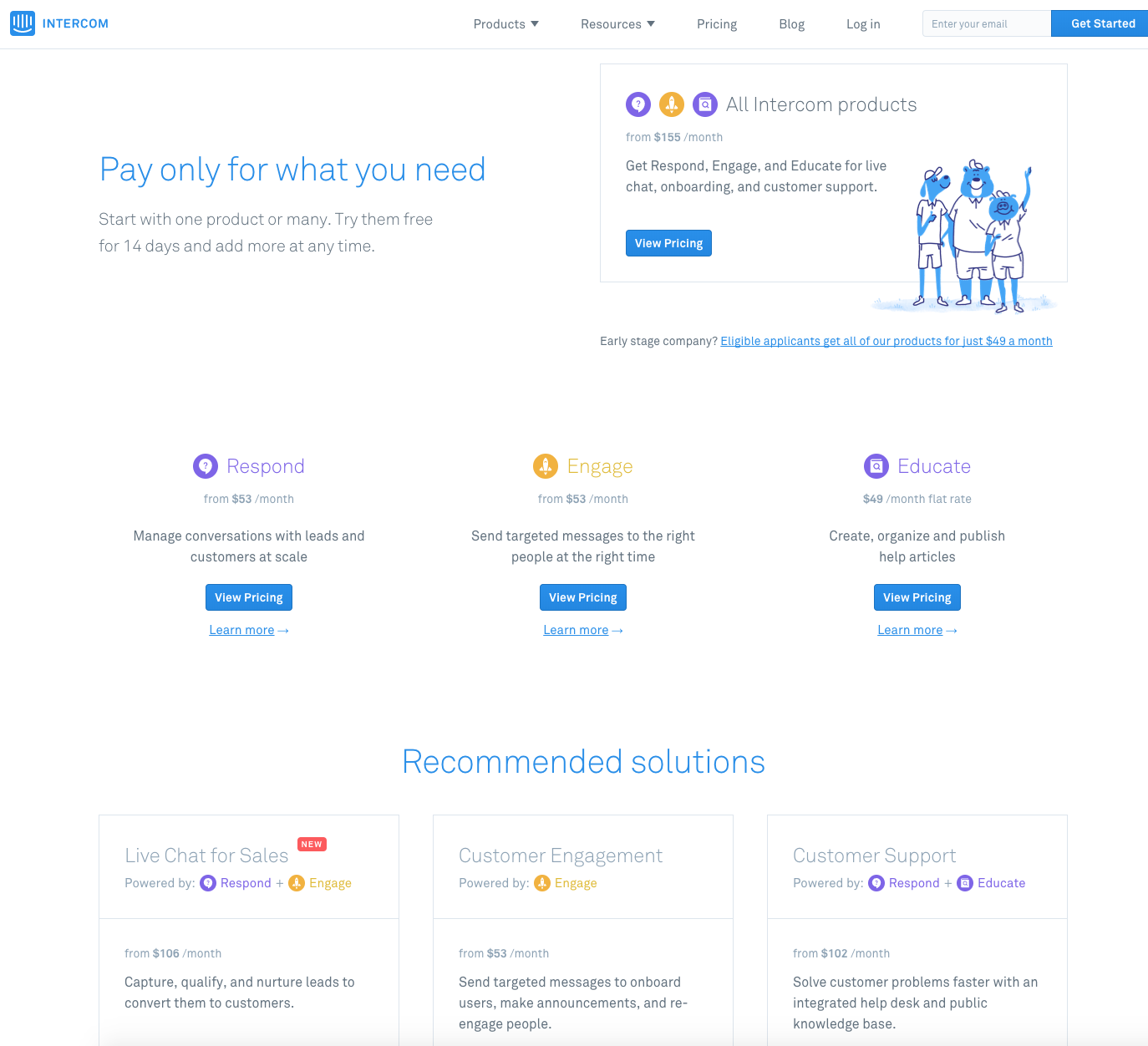
- Intercom — Intercom’s pricing page has to serve a different purpose than Asana and Swiftype’s pricing pages. Since Intercom now offers three products (Respond, Engage, Educate), they need to provide pricing information on all three products without overwhelming a visitor. I think they do a good job of this, and I’m a fan of their “Recommended solutions” section which shows how you might want to combine their products to solve business problems. It’s a great example of reducing complexity/cognitive load.
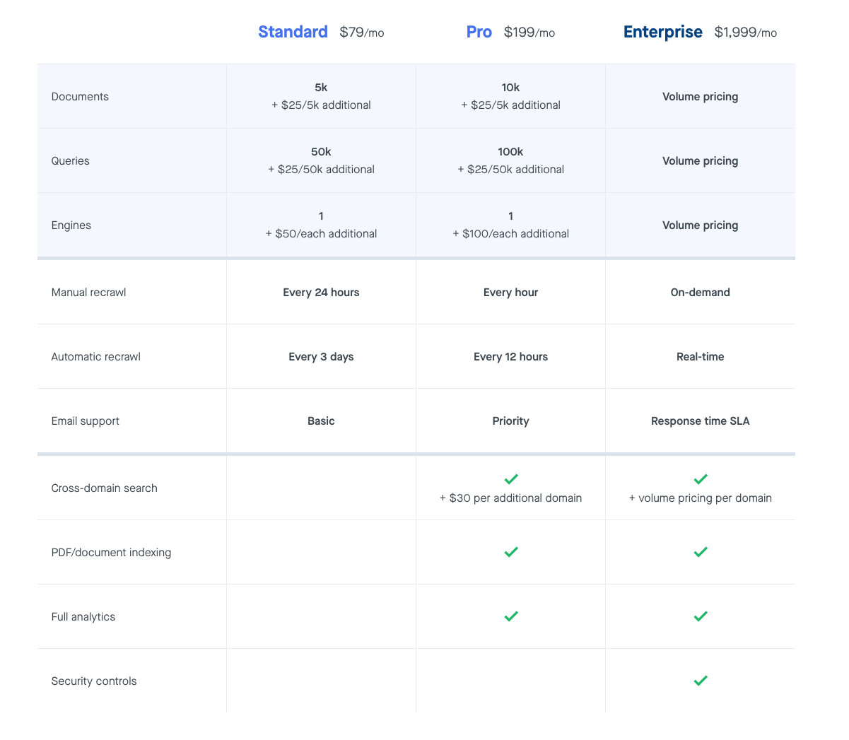
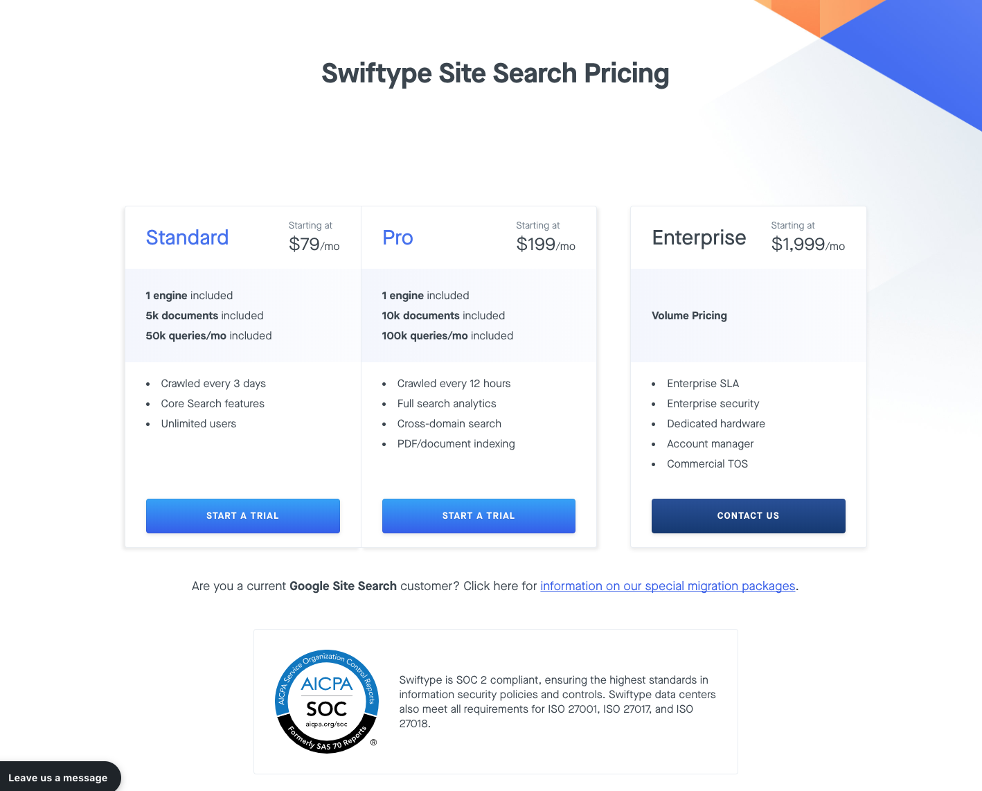
- Swiftype — The Swiftype pricing page features three tiers of pricing, with the two lower priced tiers in a single rectangle and then the Enterprise plan in a rectangle by itself. The Pro and Enterprise plan briefly note some of the additional things you’re getting by paying more and if you scroll down you’ll see this detailed comparison chart. One thing that I think we’ve done well with this page is including our SOC 2 compliance badge which promotes trust and reliability.
7 — Navigation structure and recognizing that people do click footer links
Carefully consider the links you include in your navigation bar
Navigation bars are important to a website visitor’s (especially a first time visitor) experience on your website. A clean navigation bar that features links to the things you know your potential customers care about — product pages, pricing, documentation, customer stories, etc. — will lead your website visitor to the promised land. A convoluted nav bar will lead them to your competitor’s website.
I don’t think there’s any one size fits all advice with nav bars other than including links you know are important to educating leads and converting them. You can figure out what those links are by tracking clicks with UTMs and by using heatmap tools like Hotjar or Crazy Egg. You can also learn about what on your website converts by conducting surveys and talking to your customers.
People click our footer and they probably click yours too
While only about 19% of visitors to our home page scroll to the footer, those that do are often looking for specific information and they will click on footer links to try and find it.
More specifically, people click on the “See Pricing →” link in our footer which is a good sign of intent to purchase. In fact, 1.42% of all clicks on our homepage are on this link which is a significant number of clicks based on our visitor and click volume on this page.
In short, don’t neglect your footer as it can be a real source of business. Design your footer with purpose, test what links and text you include, and you could see a lift in your overall conversion rate.
8 — Flaunt that customer validation
Let your customers do the talking
Your customers’ opinions, recommendations, and thoughts about your company are worth significantly more to your buyers than anything that you say about your product.
Logos — If you have customers that are willing to let you use their logo on your website, you should absolutely do it as it helps build trust, especially with bigger companies. In a way, this is a form of show don’t tell in the sense that you’re not saying why you’re awesome but just showing how your awesomeness is currently manifesting itself in the market.
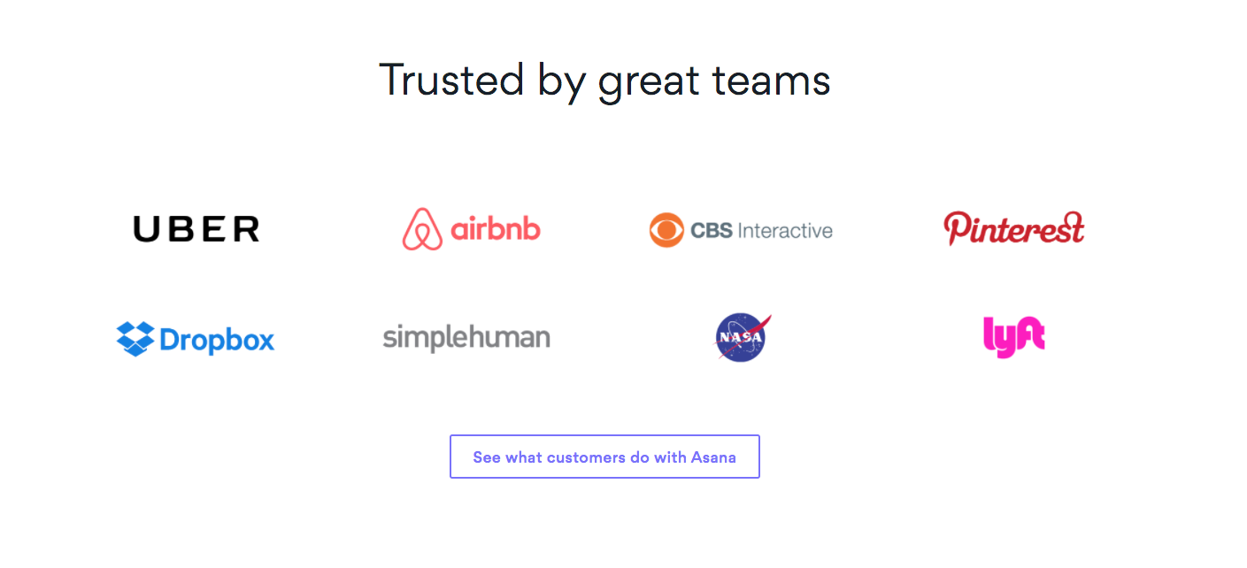
This customer logo banner is from Asana’s pricing page. Airbnb, Uber, Lyft, Nasa? Either this product provides value or these highly sophisticated companies/organizations like wasting money on useless software.
Customer Quotes — Customer quotes, in a similar manner to case studies, help visitors to get a feel for the problems your product solves from a real end user’s standpoint. Everyone is going to say their own product is great; when there are other businesses saying that a product is worth using, then it just sounds more credible.
Go forth and convert
Focus your energy
Hopefully you were able to get some helpful ideas from this post. While you might be excited to go try all of 8 them, I recommend choosing 1-2 and really focusing in on them. These tactics do work but you might not see the success you should if you spread yourself too thin.
Constant experimentation
Furthermore, it’s possible that you’ve tried some of these tactics and experienced varying levels of success and/or failure with them. As I mentioned in the section about A/B testing, the effectiveness of your conversion strategies will constantly be changing and you should keep testing your current set up as well as experimenting with new ideas.