Nailing your search UI design
As we mentioned in our last blog post about building search interfaces, having a well-designed UI is a critical component of a search installation. If your website visitors or app users are unable to find or effectively utilize your search bar, you will not be delivering the full benefit of your search engine.
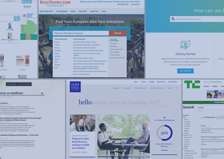
Are you implementing search and looking for some inspiration? In general, intuitive search UI designs are easy to access, match the look and feel of the overall website, and offer autocomplete results and filters when appropriate. To give you a better idea, here are 10 examples of well-designed search UIs.
1 — AppDynamics Help Center
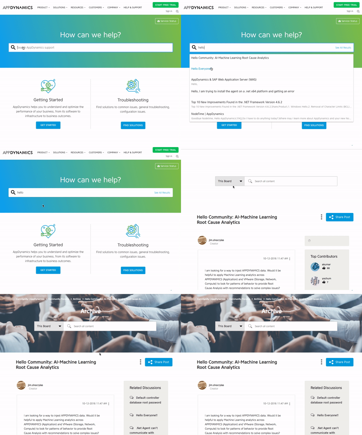
AppDynamics has placed their search bar at the top of their help center, inviting visitors to ask their questions in a natural and direct way. As you type your query, autocomplete results are shown which helps you to quickly find helpful information. If you don’t see a relevant result, you can click the “See All Results” button, which is located on the far inner right of the search bar.
After clicking that button, you will be displayed a full page of results which you can filter using the list of content types on the left side. Additionally, if you scroll to the bottom of a results page, you will see related results that the underlying search engine thinks might be relevant to you.

2 — BikeTours.com Website
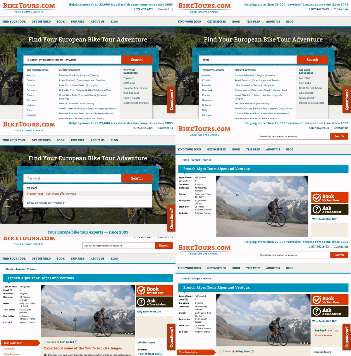
Search is an integral feature of the BikeTours.com website as the search bar is positioned in the center of the home page. When you click on the BikeTours.com search bar, you are presented with a dropdown that lists popular destinations and specific bike tours. After clicking the search bar, you can then either enter your search query or select a destination or bike tour from the dropdown. If you elect to enter your search query, you will be presented with autocomplete results.

If you don’t see a result that interests you, then you can click the search button and you will be directed to a results page with nicely designed cards highlighting tours. Additionally, the results page features rich filtering capabilities which enable you to filter content by categories like country, difficulty level, duration, and price.

3 — City of Boston Website
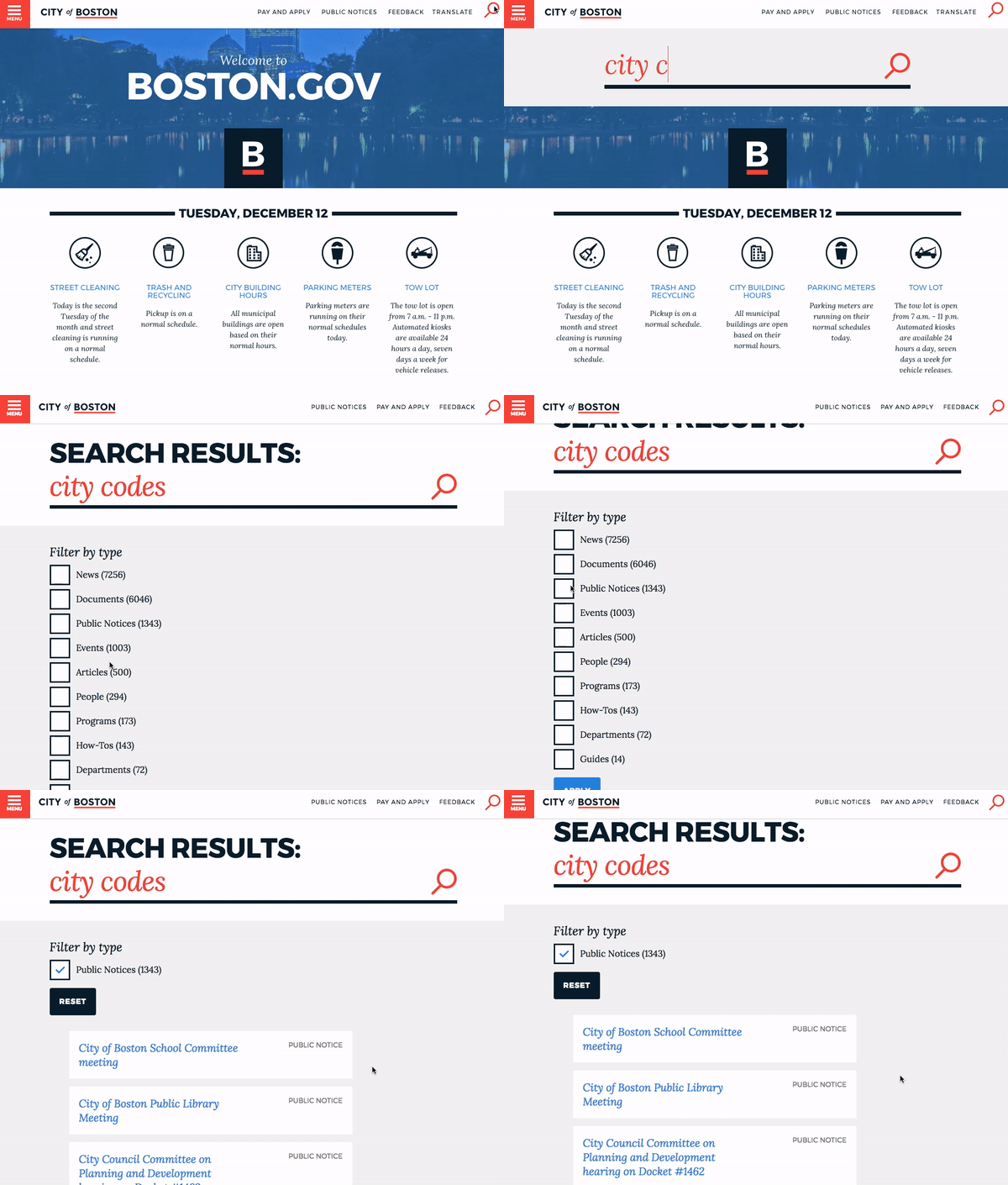
When you visit the homepage on the City of Boston’s website, you can access the search bar by clicking the search icon in the upper right corner. Once you click the icon, a large search bar sweeps across the front of the page. The search bar runs the length of the page and the CSS styling matches the overall design of the website quite nicely.
Once you enter your query and hit enter, then you are presented with a list of filters and some labeled search results. If you know which filter you should apply to your search, then you can check the appropriate box and apply the filter to narrow down your search. If you choose the wrong filter, you can quickly reset it without having to re-execute your search query.

4 — Duke University’s Fuqua School of Business Website
When you land on the homepage of Duke’s Fuqua School, you’re presented with an elegant search bar that asks, “what are you looking for?” Duke knows that many of their website visitors come to their site seeking specific information, so they’ve centered the design of their home page around a search bar. Additionally, by directing website visitors to a flexible interface like a search bar, Duke can help a wider range of people to find exactly what they’re looking for.
As you enter your search query, you are displayed with some relevant autocomplete results. You can either select one of these results or press enter to visit a full page of search results.

5 — Swiftype Website
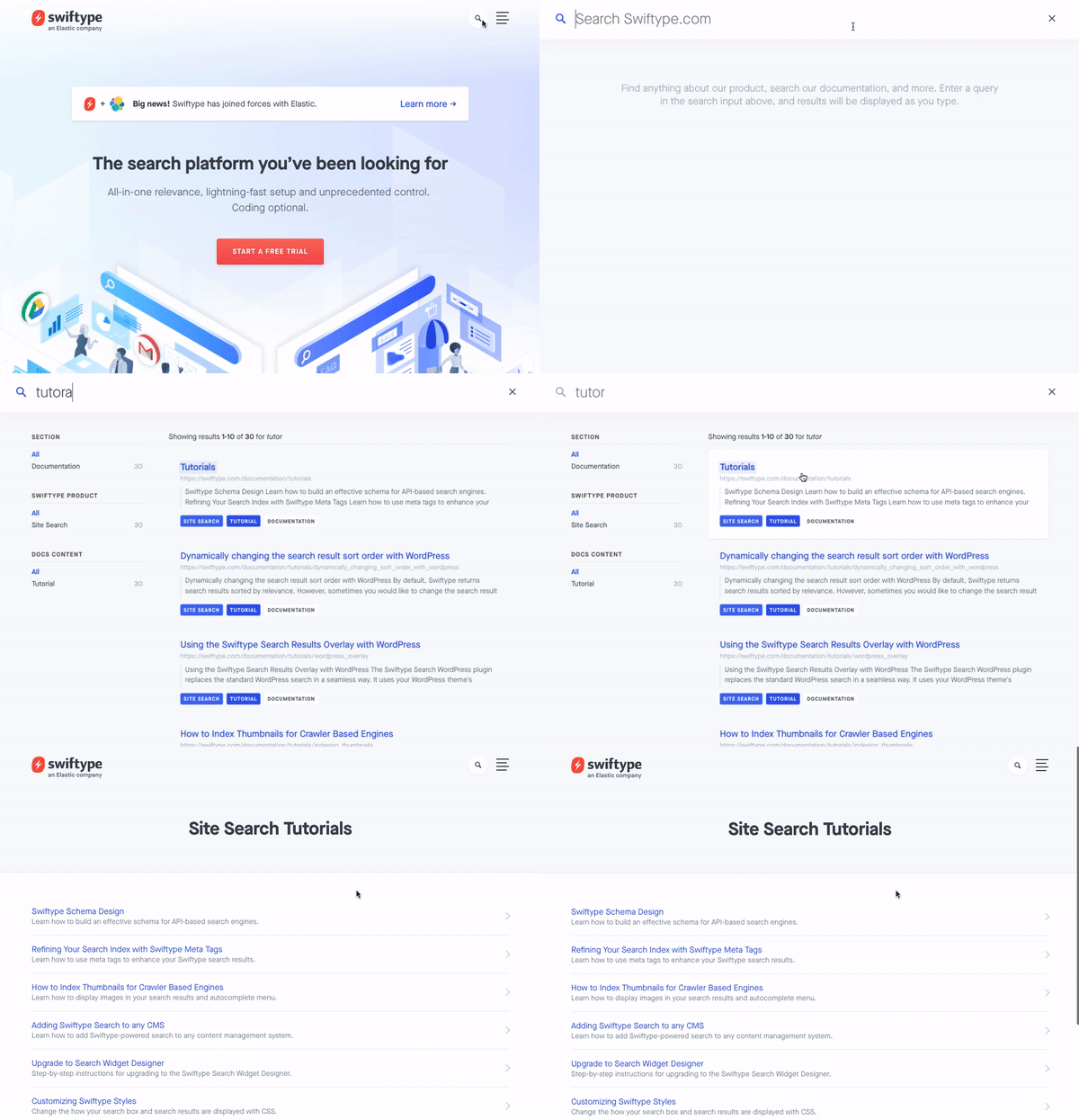
To access the site search feature on the Swiftype website, you click the search icon in the upper right corner. After clicking the icon, you are presented with a large search bar and a results container that takes up the full page. Since the Swiftype search UI is a full page experience, website searchers are able to focus on the singular task of finding what they need. Additionally, the search results are large and easy to read so users can ensure they are clicking on helpful results.
As you search, the autocomplete search results continue to update. If you do end up typing out your full query, there’s no need to press enter as your complete search results will already be displayed on the page.

6 — TechCrunch Website
When you land on the TechCrunch website, you can access the site search feature in the upper right hand corner. The home page search UI is designed so that it’s readily available but doesn’t take away focus from hot or trending home page content.
Once you enter a search query, you are presented with a full page of results that you’re able to filter by “Most Relevant” or “Latest”. Right below the search bar, you can see how many search results have been returned. On the right left side of the page, you can filter results based on date, content type, author and other attributes. Overall, TechCrunch’s search is simple and easy to use — enabling readers looking for information on specific companies or people to quickly find engaging content.

7 — Harvard Law Review Website
The Harvard Law Review’s home page is clean and well-organized as users can quickly read about recent cases, jump to sections of the website such as the Blog or Forum or enter a specific search. To enter a search query, you can utilize the search box in the navigation bar under the featured article. The HLR’s home page search UI is integrated into the overall design of the page but not too subtlety styled where it would largely go unnoticed.
After you enter a query into the search bar, you are then presented with a simple list of results as well as a count for how many results were returned. If you’d like to enter a new query, you can utilize the search bar which is now positioned at the top center of the page.

8 — PetCareRx Website
The PetCareRx search bar starts out in the upper right hand corner of the page but expands to the full width of the nav bar when you click on it. Many people come to the PetCareRx store knowing what product or brand they are looking for so search is the ideal interface for them. This partial page search UI has one filter — “Search PetPlus-eligible items only” — which keeps things uncluttered but enables high intent shoppers to get to what they need more quickly.
If you do not select an autocomplete result when you enter a search query, you are brought to a results page where you can apply additional filters like “Category” and “Product Feature”. Below these filters, related search terms are displayed which enable shoppers to easily change their existing search or find additional products.

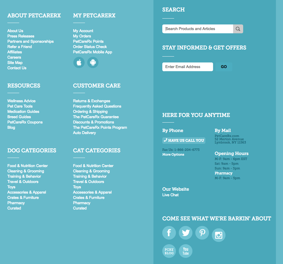
PetCareRx also has a search bar in their large website footer, giving them more opportunity to drive website visitors to content and products that are relevant to them.

9 — Twilio Help Center
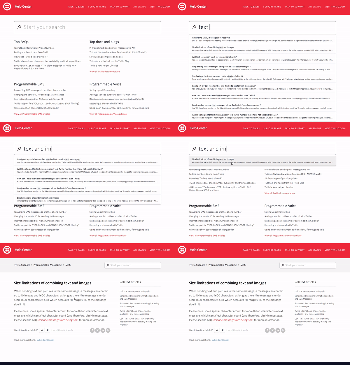
Similar to AppDynamics, Twilio prominently features search in their help center. The grey-bordered search bar extends across the top of the help center right under the red header. Under the search bar, Twilio has listed some popular topics to help guide visitors who do not know exactly what they’re looking for.
As you enter a search query, relevant autocomplete results are displayed. If you do not see what you need in the autocomplete results, you can press enter and be directed to a full results page which will highlight your search term in all of the returned results. To learn more about how Twilio has leveraged search technology to improve their help center and overall customer experience, you can read this case study.

10 — Stitch Fix Men’s Style Guide Website
Stitch Fix’s Style Guide is a strong content marketing website that provides helpful information for both existing customers and potential future customers. Stitch Fix wants to make sure all of their high-quality content is accessible, so they’ve included a search bar on their Style Guide website.
The search bar is in the upper right hand corner of the page and stays fixed there after you enter a search query. As you enter a search term, autocomplete results are displayed but you can also press enter to be displayed a full page of search results. Although search is not a prominent feature of this website, it plays an important role in helping visitors to continue getting value from content when its not featured on the home page.


Implementing your search UI
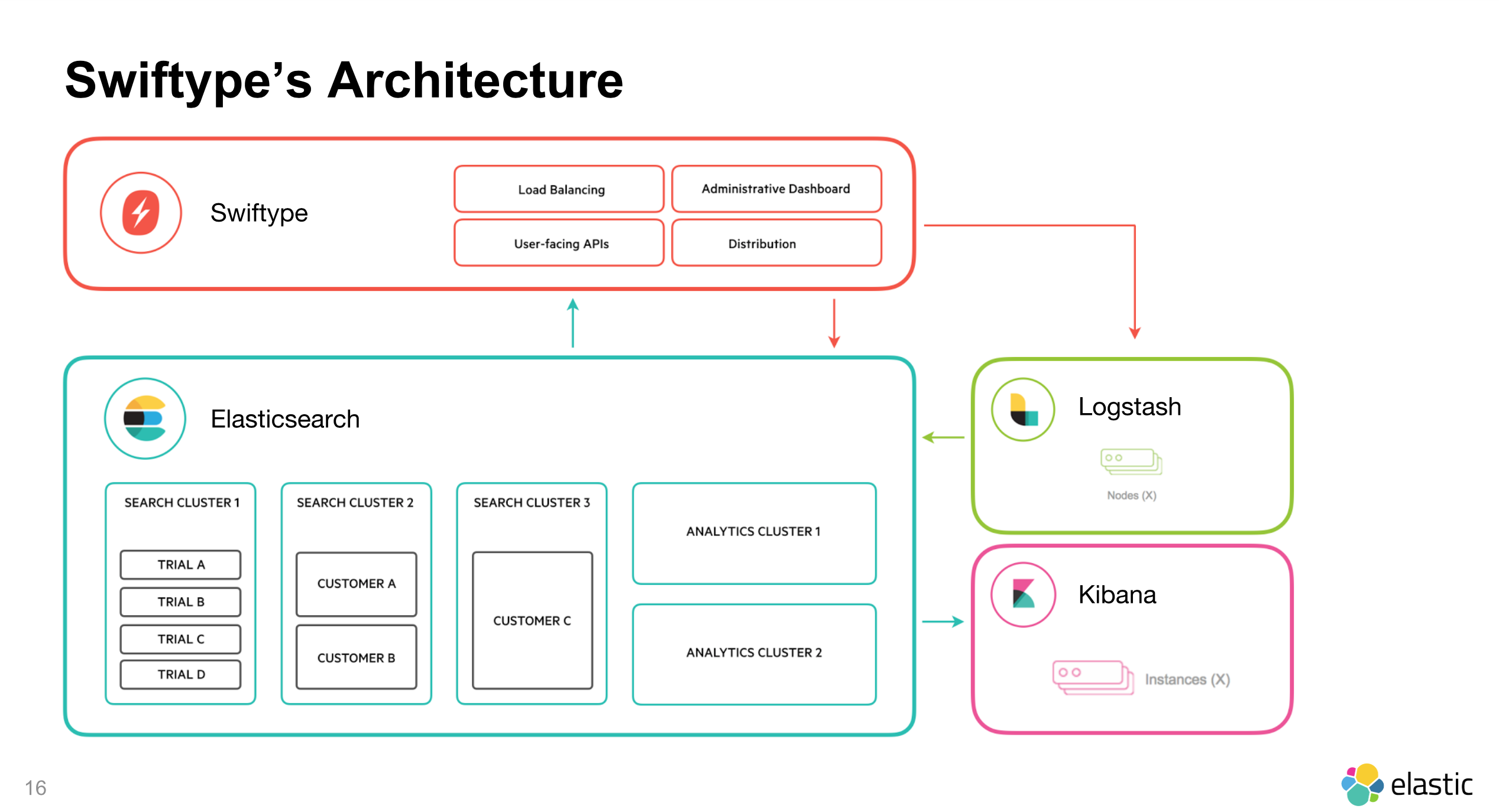
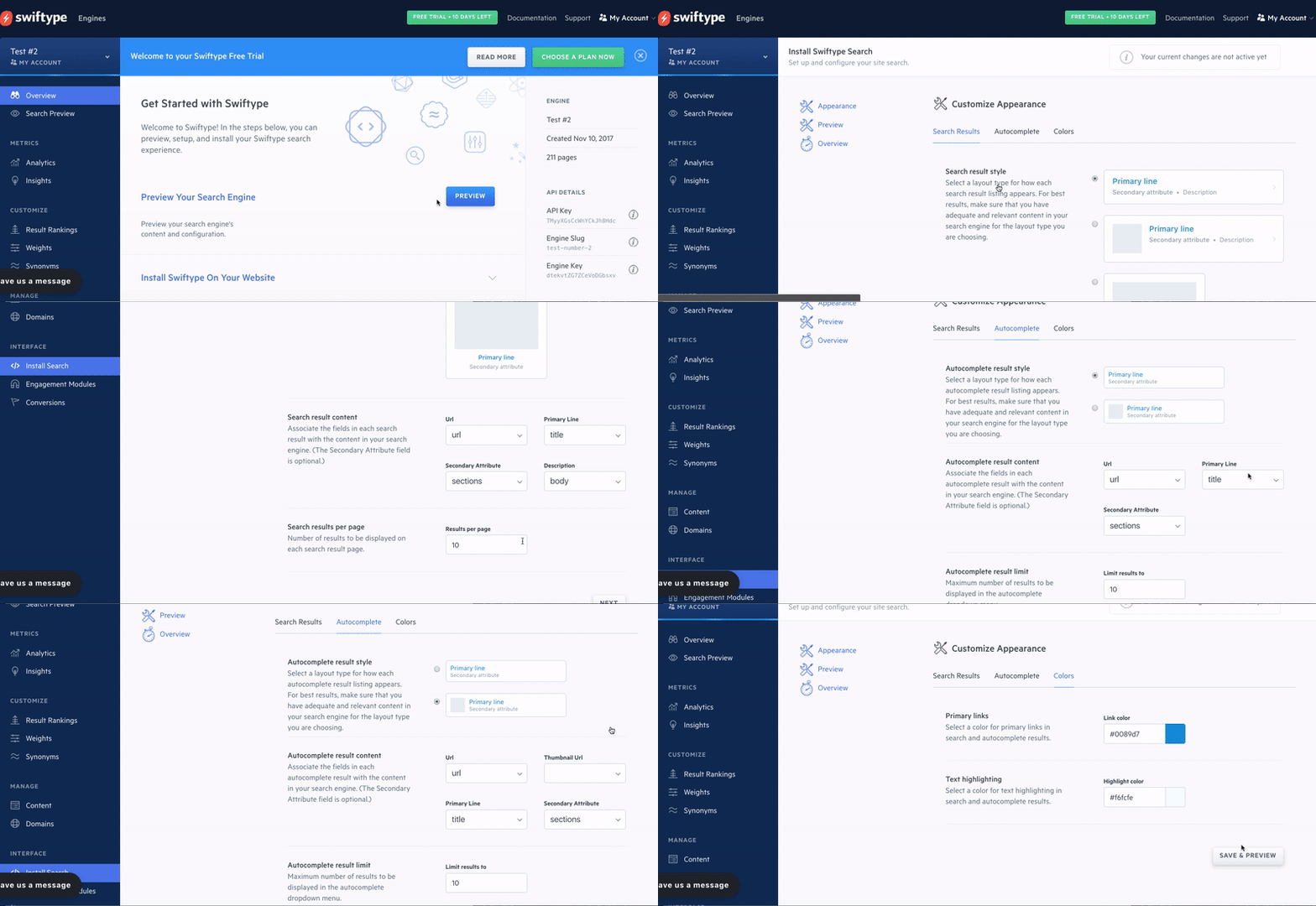
At Swiftype, we provide powerful search as a service complete with customizable search UIs. We make it easy for you to get a search engine up and running by providing a web crawler and API for ingesting data, an intuitive admin dashboard for managing your search experience, and multiple options for implementing your search UI including our search and autocomplete jQuery libraries. Ready to get started with Swiftype? Sign up for your 14-day free trial here.

