The Swiftype Blog / Month: December 2017

Swiftype 2017 year in review

You can say 2017 was an eventful year for Swiftype. From starting the year with a product launch of Swiftype Enterprise Search, to helping countless customers migrate from their discontinued Google Site Search solutions, to joining forces with Elastic, the makers of popular open source products such as Elasticsearch, Kibana, Beats, and Logstash. To celebrate the new year, here’s a look back at the top blog posts of 2017.

1 — Swiftype Joins Forces with Elastic

“We are thrilled today to announce that Swiftype is joining forces with Elastic, the makers of Elasticsearch. This new alliance will accelerate the development of new features and tools that will make it easier for you to manage and deploy world-class search functionality to your website or organization.”

We’ve built some great search products at Swiftype over the past 5 years, but honestly, we are just getting started. Joining forces with Elastic enables us to partner with the best search experts in the world, so we can continue to innovate and deliver an increasingly diverse suite of powerful search solutions.

2 – Google Site Search is Sunsetting: What to Expect and How to Move On

“By now you’ve probably heard that Google plans to sunset Google Site Search (GSS) and direct existing customers to use their free replacement, the Google Custom Search Engine (CSE). Unfortunately for these customers, the CSE forces websites to show ads alongside their search results, so the transition isn’t as simple as it may seem. As the dominant alternative to GSS for the past 4 years, we at Swiftype are very familiar with the migration process, and we’re happy to share some of our advice to those weighing their options.”

In early 2017, Google announced it was sunsetting their widely used Site Search product. Since Swiftype Site Search is similar to GSS in its ease of use and out-of-the-box relevancy, many former Google customers turned to us for their website search needs.

3 — Customers Say It Best

“Each month, nearly 900,000 buyers utilize G2 Crowd for unbiased user reviews to assess which products are best for their businesses. Swiftype’s reviews on G2 Crowd both reaffirm the value of our product to our customers, and allow us to improve our products to make sure each and every user is satisfied with their site search.”

When potential Swiftype customers are evaluating our solution, we really encourage them to do a free trial and spend some time using our product. We believe in our product and consistent positive product reviews from our customers help to reaffirm that belief.

4 — Introducing AI-Powered Enterprise Search

“Today, we’re excited to announce a new product that addresses this problem head-on: Swiftype Enterprise Search. By integrating artificial intelligence with our industry leading search technology, Swiftype Enterprise Search is a powerful new way for employees to seamlessly access the data they need, from any device, across the many applications their jobs require.”

Earlier this year, we launched Swiftype Enterprise Search  — a modern, AI-powered search solution that enables companies to unify content from all of their apps and data stores. Our enterprise search solution is available on web, desktop and mobile and integrates with your existing workflows so you can find the files you need without breaking your concentration.

5 — 10 Examples of Well-Designed Search UIs

“Are you implementing search and looking for some inspiration? In general, intuitive search UI designs are easy to access, match the look and feel of the overall website, and offer autocomplete results and filters when appropriate. To give you a better idea, here are 10 examples of well-designed search UIs.”

At Swiftype, we’ve helped thousands of businesses to index their content, customize their search engines and then implement search interfaces on their website, either with our JavaScript snippet or our search and autocomplete jQuery libraries. Over the years, we’ve learned what makes for a good search experience and can confidently tell you that these 10 companies have nailed their search UIs — helping them to get the full value of their search technology and enabling their customers to easily find what they need.

6 — How Asana, Twilio, and SurveyMonkey optimized their customer support centers [Infographic]

“Asana, Twilio, and SurveyMonkey have all invested heavily in creating high-quality support content. To ensure this content is easily accessible, these companies leverage advanced search technology that provides relevant results to their customers and actionable analytics for them.”

One big use case for our search technology is in customer support centers. Companies like those listed above utilize Swiftype Search as a flexible portal for their customers to access their support documentation. Since search is a natural way for people to access a wide array of support content, our customers have been very successful in reducing their manual support loads while simultaneously helping their customers to resolve their issues more quickly.

7  — How site search makes higher education websites more accessible

“When a website visitor elects to use the search bar on your website, they have a specific goal in mind, so it’s important to provide them with relevant search results. At Swiftype, we specialize in building relevant site search technology and making it incredibly easy to set up on your website. We’re fortunate to be able to work with some great universities, and we wanted to highlight their Swiftype success stories.”

University websites generally have lots of pages designed to cater to a diverse constituency of prospective students, current students, faculty, staff and parents. Powerful search technology like Swiftype helps higher education institutions to improve the accessibility of their websites so that their site visitors can find the content that’s relevant to them.

8 — Great Developers Ship, They Don’t Configure Search

“Engineers and developers want to spend more time developing products and websites, not configuring search. It’s pretty obvious, and understandable. Developing allows them to be creative, solve problems, and build new things. Search, albeit a critical feature for site visitors, is part of a site’s foundation. It should already be there. And it should work, and work well.”

As you can imagine, we love to build search products at Swiftype and can tell you that they’re difficult to get right. When you’re working on a product or website and need search functionality, you may not have the time or resources to allocate towards building search. And that’s where we come in with our robust search as a service solution and well-documented developer APIs.

9 — Welcome to the Swiftype office in San Francisco [HQ Photo Tour]

“Welcome to Swiftype Headquarters in San Francisco, California. Founders Matt Riley and Quin Hoxie have created a comfortable and fun office environment with an open floor plan, scattered lounges, and various collaborative areas. Take a look at our office photos below to experience a day in the life of a Swiftype team member.”

Take a tour of the Swiftype/Elastic San Francisco Office and get a feel for what it’s like to work at a high-growth startup.

10 — Swiftype API overview: Customize your search engine

“The Swiftype API gives you full control over the schema of your search engine and the content that you index. With the Swiftype API endpoints, you are able to index data, execute search queries, and access rich analytics.”

One of our main focuses for the Swiftype Site Search product is to make it extremely easy to get your data indexed so you can quickly install a working search bar. Some of our customers prefer to interact with Swiftype through our API or client libraries which enables them to build search to their exact specifications, from the data ingestion process to user interface design.

Test drive Swiftype Site Search

At Swiftype, we provide powerful search as a service complete with customizable search UIs. We make it easy for you to get a search engine up and running by providing a web crawler and API for ingesting data, and an intuitive admin dashboard for managing your search experience. Ready to get started with Swiftype? Sign up for your 14-day free trial here.
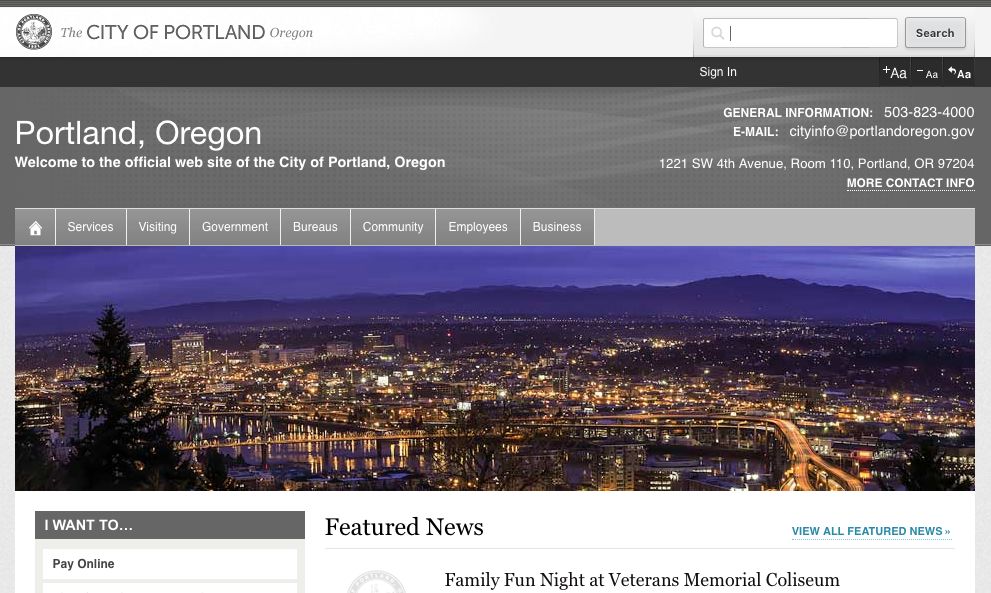
On the Search: The City of Portland Levels up Their Website Search

The following is a Q&A with the City of Portland’s Richard Davies about his experience implementing and managing Swiftype Site Search.

Portland: A well-cultured city on the rise

With a population well over 600,000, Portland is the largest city in Oregon and the second largest in the Northwest. Known as a city with great parks and vibrant beer, food and coffee cultures, Portland is both a popular place to visit and live. Over the past 20 years, Portland has seen a significant boom in the the technology and creative marketing industries, and its GDP per person has grown by 50%.

As the government of a large and innovative city, the City of Portland strives to provide high-quality service to its citizens. Two key ways they do this is by maintaining a high-quality website and leveraging technology to keep their citizens informed. On a daily basis, Portlanders visit their city’s website for information about city codes, community events, utilities, and many other things that impact their lives.

The City of Portland implements Swiftype

Earlier this year, the City of Portland turned to Swiftype as a replacement for their Google Site Search installation. Portland was able to get up and running very quickly with Swiftype and their citizens have been happy with their new search solution. Recently, we took some time to chat with Richard Davies, a web application developer for the City of Portland, to hear about his experience implementing and maintaining Swiftype for Portland’s website. Here’s what he had to say.

Question and Answer with the City of Portland’s Richard Davies

Q: Why did the City of Portland decide to use Swiftype?

A: Our website needed to migrate off of unsupported Google search solutions to a more modern and powerful search solution. Swiftype has been very easy to implement and is faster and delivers more relevant results and advanced functionality that was not available with our previous search solution.

Before implementing Swiftype, we looked at a number of search solutions ranging from self-hosted to cloud-based, open source to proprietary, and Swiftype hit the sweet spot for us between features and cost and ease of use/configuration.


Q: How does the City of Portland use Swiftype? What is your use case?

A: We use Swiftype Site Search to provide search functionality on our main website, www.portlandoregon.gov. This site contains 200,000+ pages and is used by all of the bureaus and offices within the City of Portland to host both public and intranet content, as well as various web applications supporting such things as online payments, business license registrations, and stormwater calculations, etc.

With such a large, diverse website, searching is a critical feature because it’s one of the primary means our users use to locate desired information on our site. Our experience has been so positive that we will keep it in mind for use with future projects/sites.

Q: What are the best Swiftype features?

A: Some of the critical features for us are:

  • Quick-and-easy setup/configuration/maintenance
  • The ability to index and search both public and private content on our website and deliver an appropriate set of results to public users and authenticated users
  • Ability to index PDF and Word documents
  • Ability to customize rankings and search results
  • Customizable meta tags and content inclusion/exclusion tags
  • Developer APIs


I think this is a good indication of how Swiftype has greatly improved the accuracy and relevancy of our search results, thus enabling our users to find what they’re looking for with fewer searches.


Richard Davies
Web Application Developer


Q: In what ways have you utilized data from the Swiftype Search Analytics dashboard?

A: We have used the list of most popular searches to help us identify pages where we need to customize the search results to ensure that we’re returning the most relevant information for these frequently requested topics.

Also, although we only have a limited amount of time to compare, the total number of searches has gone down dramatically since our move to Swiftype (about half of our previous total average). I think this is a good indication of how Swiftype has greatly improved the accuracy and relevancy of our search results, thus enabling our users to find what they’re looking for with fewer searches.


Q: Do you think Swiftype Search has made it easier for your website visitors to find the information they need?

A: Yes, I touched on this a little in my previous answer. I believe the following factors have all contributed to making major improvements with our search experience:

  • Searching with Swiftype is remarkably faster than our previous solution
  • The HTML attributes for content inclusion/exclusion allow us to focus the index on the relevant parts of a page and deliver more relevant results
  • Customizable meta tags allow for improved filtering
  • We can customize search rankings ensure that the most relevant results are at the top

We were aware that many users were frustrated and unsatisfied with our previous search solution and we received many positive comments after we switched to Swiftype. We were able to do a seamless migration and suddenly it was as if the search had just “magically” started working way better for our users. Everyone was much happier!

Shout out to Richard and the City of Portland

Big thanks to Richard for taking the time to chat with us! We’re really excited to know that our technology is being used to help Portlanders find information more easily. If you would like to learn more about Swiftype Site Search, you can download the Ultimate Guide to Website Search for Government or sign up for a 14-day free trial.

Holiday Website Checklist: 7 Must-Have Features

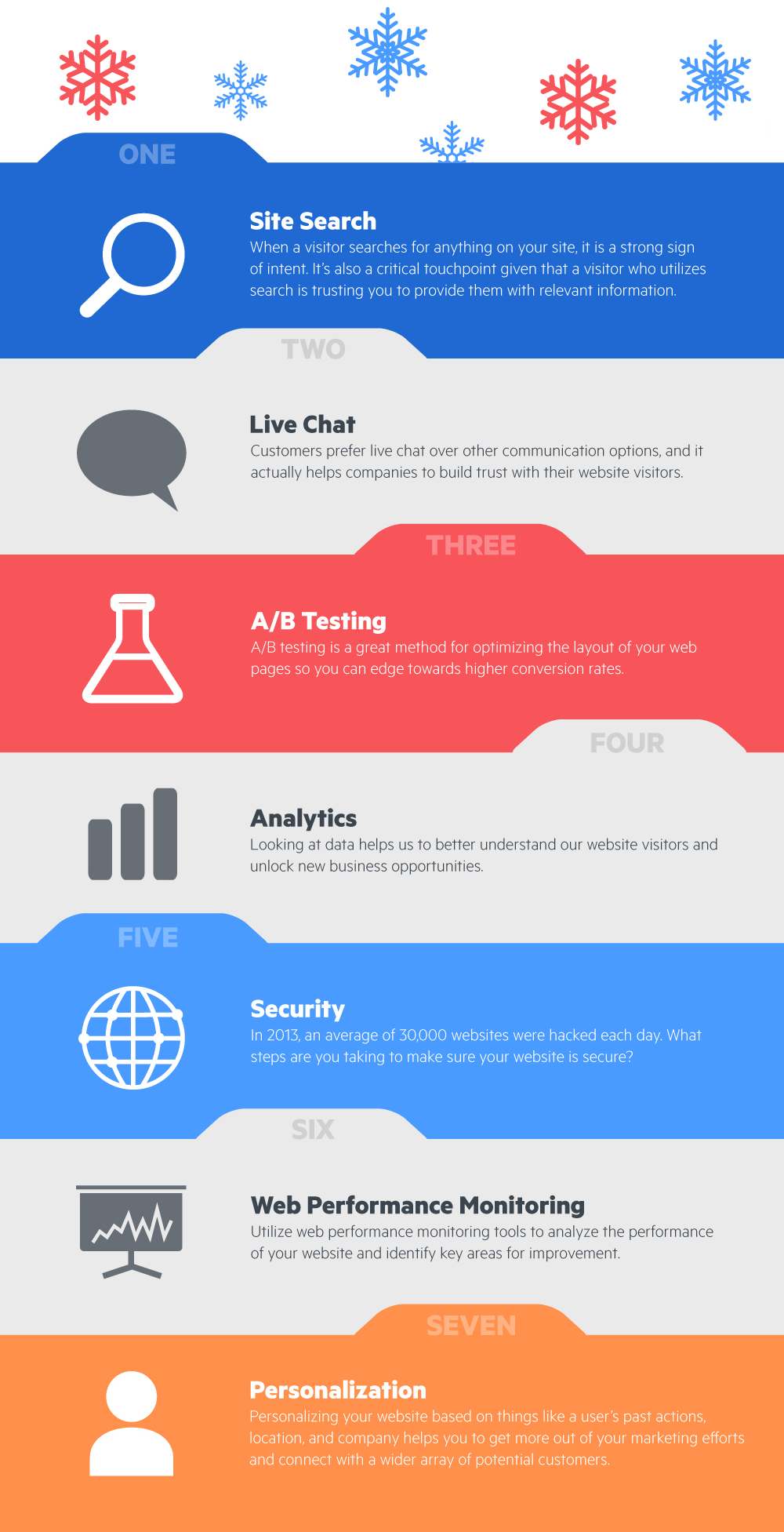
Welcome to the Holiday Website Checklist! The holiday season is a great time of year to relax, celebrate, and reflect on the ups and downs of the past year. While we don’t want you spending too much time working this holiday, we did want to give you a helpful list for reviewing the technology you use on your website for things like security, analytics, and customer communication. We’ve created a high-level infographic as well as a detailed list which you can find below. After reviewing this list, we hope you can move into the new year with some ideas for creating an even stronger web presence.

Download Infographic

1 — Site Search

When a visitor searches for anything on your website, it is a strong sign of intent. It’s also a critical touchpoint given that a visitor who utilizes search is trusting you to provide them with relevant information. While we may be biased, site search is at the top of our holiday wishlist because it’s an often underrated website feature that helps you to better engage your visitors. In addition, it’s a real-time source of actionable data that informs you of what your visitors are interested in and will help you to better recognize trends in their behavior. Looking to add site search or level up your existing installation? You can sign up for a 14-day free trial of Swiftype Site Search here or learn more here.

2 — Live Chat

Customers prefer live chat over other communication options (Source: Forbes), and it actually helps companies to build trust with their website visitors. It makes sense if you think about it as chat is a natural means of communication and it makes people feel valued that your company is there to speak with them. Over the past few years, live chat has exploded in popularity as the tools have improved and companies have realized the financial benefits of implementing chat. If you’re looking for a live chat tool, check out Olark, Intercom, or Drift.

3 — A/B testing

A/B testing is a great method for optimizing the layout of your web pages so you can edge towards higher conversion rates. Tools like Optimizely and Google Optimize provide a robust framework for rapidly conducting tests so you can iterate on your website design. If you’re new to A/B testing and not sure where to start, check out this blog post from Kissmetrics.

4 — Analytics

Looking at data helps us to better understand our website visitors and unlock new business opportunities. You’re likely already using Google Analytics or a similar tool to track things like social referrals, traffic, and conversions. If you’re looking to utilize some of the more advanced features of Google Analytics, check out this course from Google. Heatmap tools like Hotjar are another great source of insight — helping you to understand what elements of your website are working and what needs to be changed.

5 — Security

In 2013, an average of 30,000 websites were hacked each day (Source: Forbes). What steps can you take to make sure your website is secure? If you’ve built your own website, you’ll want to use a tool like Gemnasium to monitor your website for security vulnerabilities (you don’t want to be the next Equifax). Additionally, if you’re not currently using HTTPS across your website, it’s probably a good idea to switch over. This article from Creative Bloq has some great tips about how to handle things like passwords, SQL injections, and file uploads as well as a list of helpful website security tools.

6 — Web performance monitoring

Google searches the entire web in a fraction of a second, so it makes sense that people expect your website to be fast. You can use tools like Pingdom or Uptrends to analyze the performance of your website and identify key areas for improvement. Additionally, Google has a free tool called PageSpeed which analyzes your site’s performance and offer recommendations for improving it. Overall, improving your site’s performance is an easy win as it’s relatively simple to identify problem areas and make the necessary changes.

7 — Personalization

Why serve up a generic web page when you can tailor your content on a visitor-by-visitor basis? Personalizing your website based on things like a user’s past actions, location, and company helps you to get more out of your marketing efforts and connect with a wider array of potential customers. If you’re using Marketo for marketing automation, they have a web personalization solution. If you’re using another marketing automation system, many of them offer personalization options and there are also some vertical-specific tools which you can read about here.

Hopefully, you found this list helpful and came away with some new ideas to think about as we head into the new year. From all of us at Swiftype and Elastic, we wish you a happy holiday!

10 Examples of Well-Designed Search UIs

Nailing your search UI design

As we mentioned in our last blog post about building search interfaces, having a well-designed UI is a critical component of a search installation. If your website visitors or app users are unable to find or effectively utilize your search bar, you will not be delivering the full benefit of your search engine.

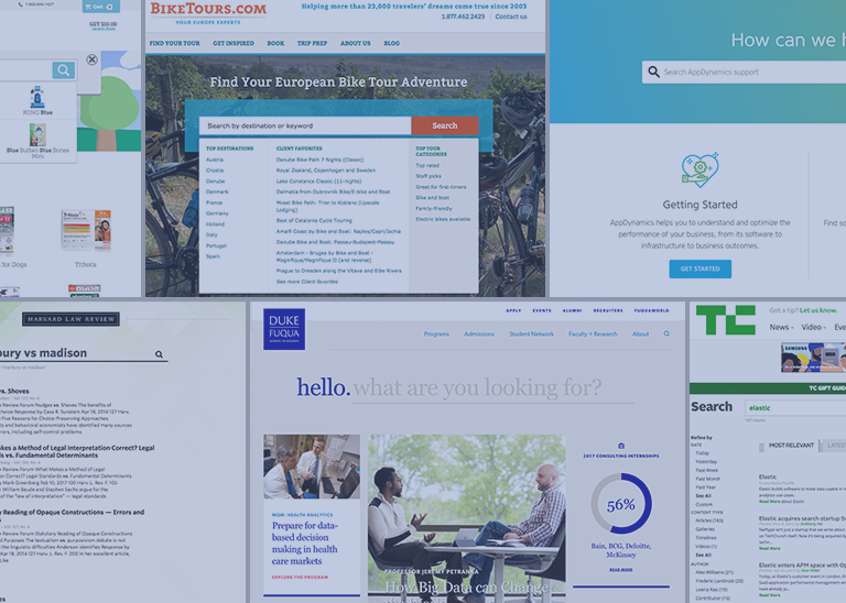
Are you implementing search and looking for some inspiration? In general, intuitive search UI designs are easy to access, match the look and feel of the overall website, and offer autocomplete results and filters when appropriate. To give you a better idea, here are 10 examples of well-designed search UIs. 


1 — AppDynamics Help Center

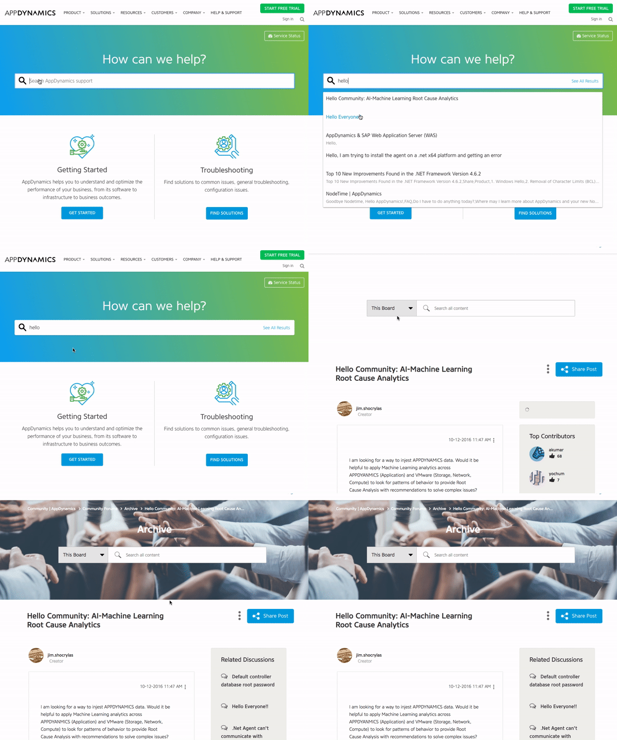
AppDynamics has placed their search bar at the top of their help center, inviting visitors to ask their questions in a natural and direct way. As you type your query, autocomplete results are shown which helps you to quickly find helpful information. If you don’t see a relevant result, you can click the “See All Results” button, which is located on the far inner right of the search bar.

After clicking that button, you will be displayed a full page of results which you can filter using the list of content types on the left side. Additionally, if you scroll to the bottom of a results page, you will see related results that the underlying search engine thinks might be relevant to you.


2 — BikeTours.com Website

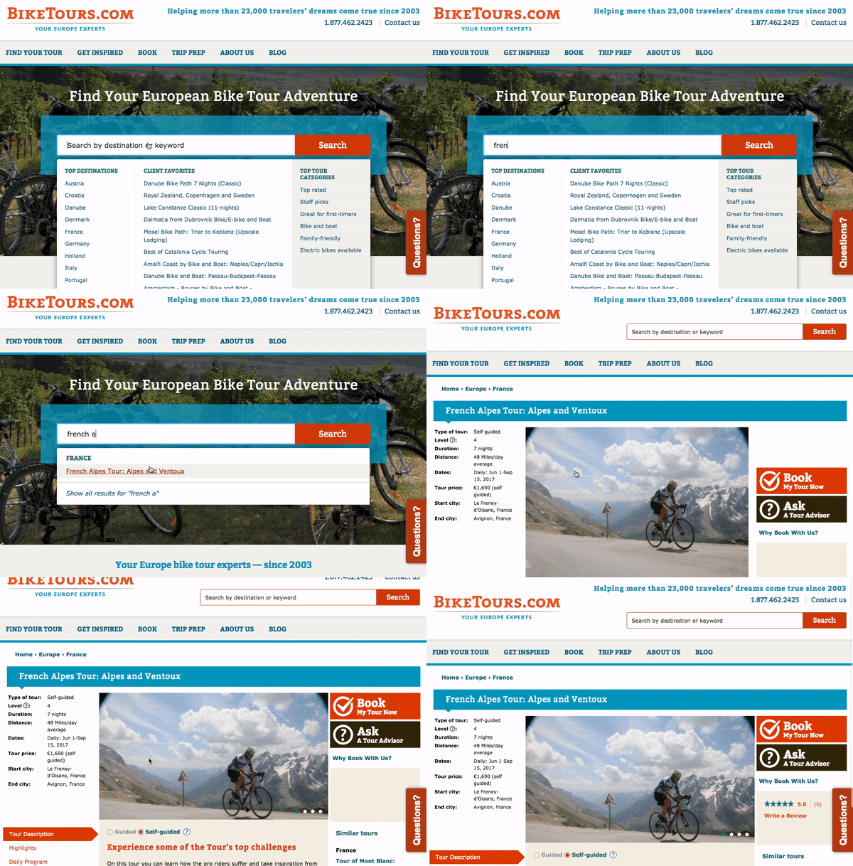
Search is an integral feature of the BikeTours.com website as the search bar is positioned in the center of the home page. When you click on the BikeTours.com search bar, you are presented with a dropdown that lists popular destinations and specific bike tours. After clicking the search bar, you can then either enter your search query or select a destination or bike tour from the dropdown. If you elect to enter your search query, you will be presented with autocomplete results.

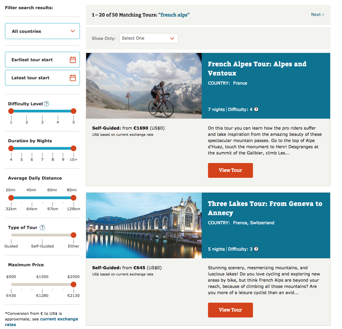
If you don’t see a result that interests you, then you can click the search button and you will be directed to a results page with nicely designed cards highlighting tours. Additionally, the results page features rich filtering capabilities which enable you to filter content by categories like country, difficulty level, duration, and price.


3 — City of Boston Website

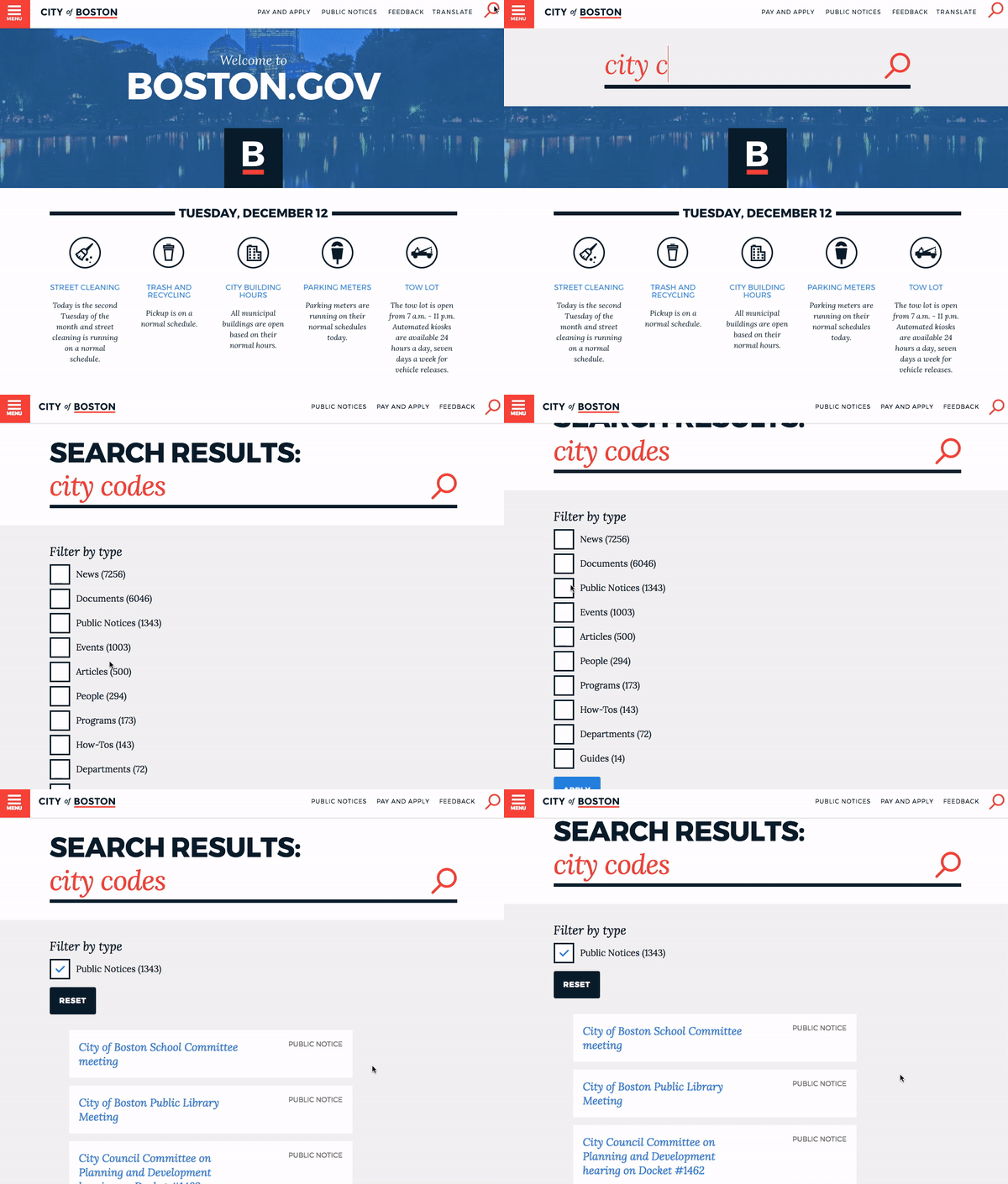
When you visit the homepage on the City of Boston’s website, you can access the search bar by clicking the search icon in the upper right corner. Once you click the icon, a large search bar sweeps across the front of the page. The search bar runs the length of the page and the CSS styling matches the overall design of the website quite nicely.

Once you enter your query and hit enter, then you are presented with a list of filters and some labeled search results. If you know which filter you should apply to your search, then you can check the appropriate box and apply the filter to narrow down your search. If you choose the wrong filter, you can quickly reset it without having to re-execute your search query.


4 — Duke University’s Fuqua School of Business Website

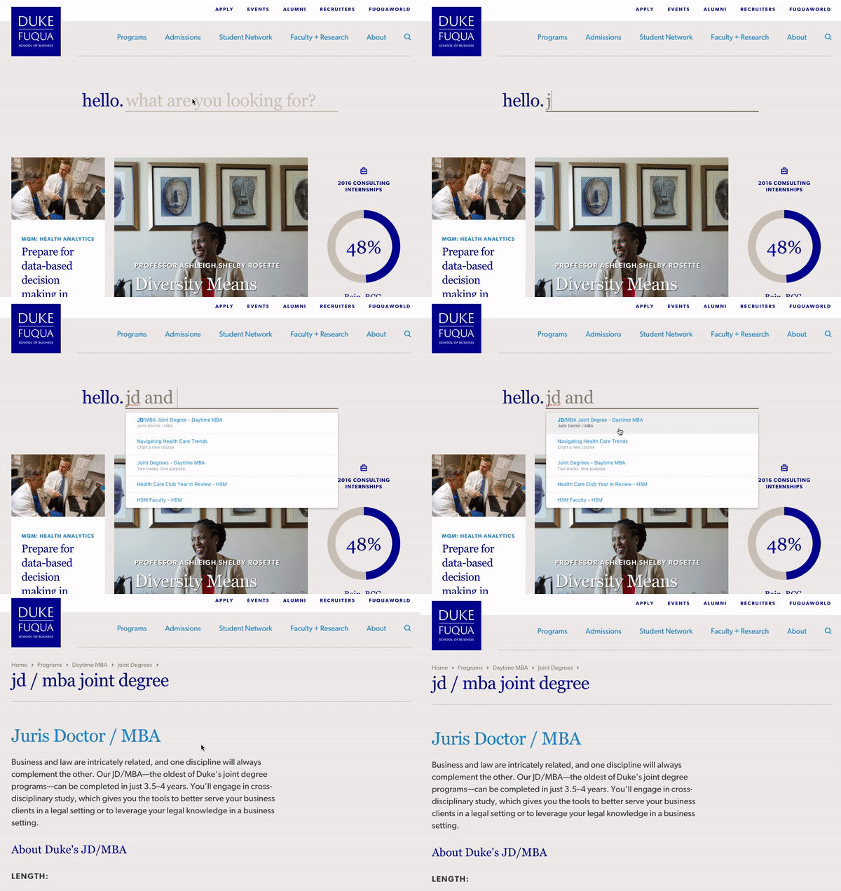
When you land on the homepage of Duke’s Fuqua School, you’re presented with an elegant search bar that asks, “what are you looking for?” Duke knows that many of their website visitors come to their site seeking specific information, so they’ve centered the design of their home page around a search bar. Additionally, by directing website visitors to a flexible interface like a search bar, Duke can help a wider range of people to find exactly what they’re looking for.

As you enter your search query, you are displayed with some relevant autocomplete results. You can either select one of these results or press enter to visit a full page of search results.


5 — Swiftype Website

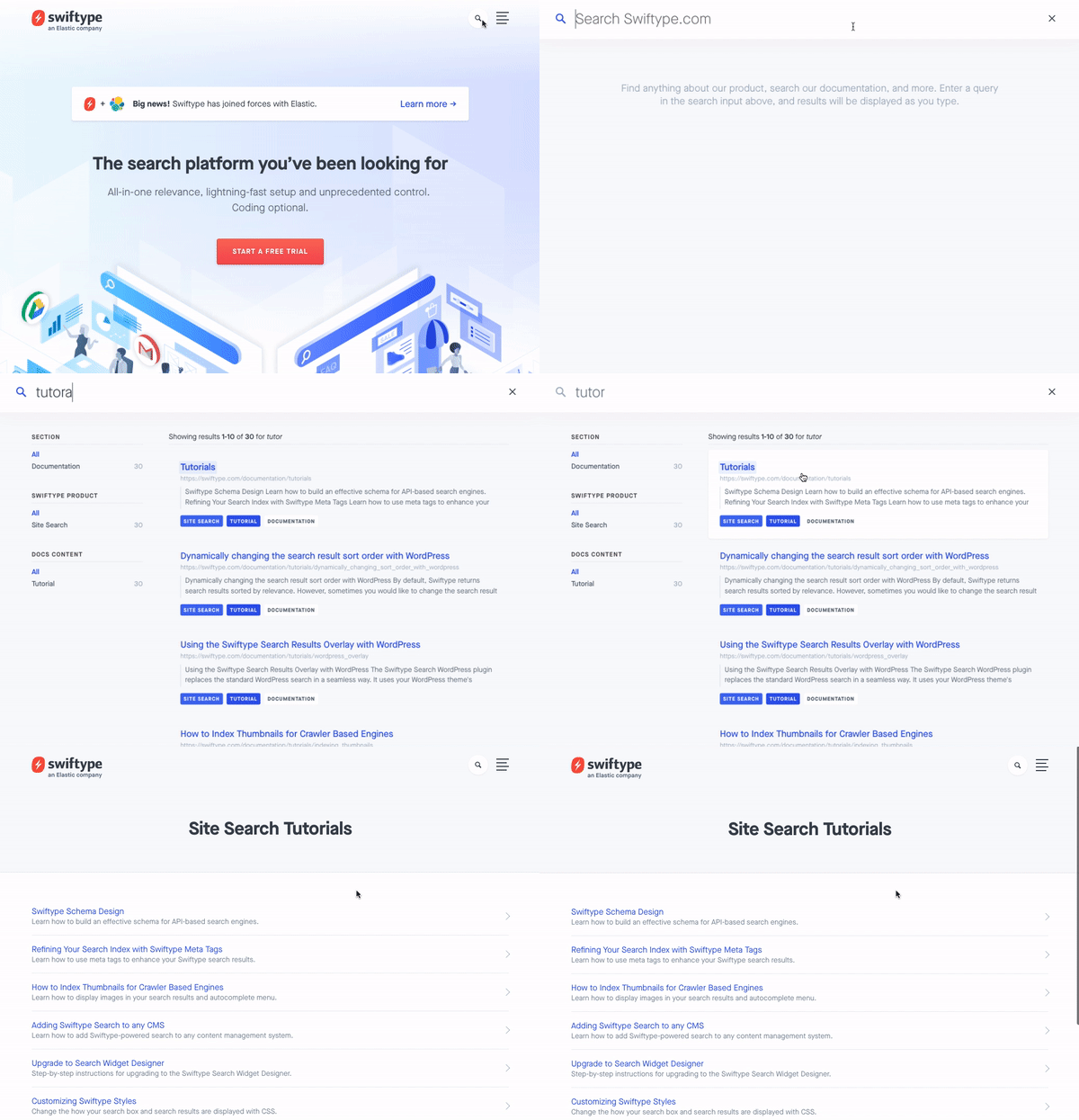
To access the site search feature on the Swiftype website, you click the search icon in the upper right corner. After clicking the icon, you are presented with a large search bar and a results container that takes up the full page. Since the Swiftype search UI is a full page experience, website searchers are able to focus on the singular task of finding what they need. Additionally, the search results are large and easy to read so users can ensure they are clicking on helpful results.

As you search, the autocomplete search results continue to update. If you do end up typing out your full query, there’s no need to press enter as your complete search results will already be displayed on the page.


6 — TechCrunch Website

When you land on the TechCrunch website, you can access the site search feature in the upper right hand corner. The home page search UI is designed so that it’s readily available but doesn’t take away focus from hot or trending home page content.

Once you enter a search query, you are presented with a full page of results that you’re able to filter by “Most Relevant” or “Latest”. Right below the search bar, you can see how many search results have been returned. On the right left side of the page, you can filter results based on date, content type, author and other attributes. Overall, TechCrunch’s search is simple and easy to use — enabling readers looking for information on specific companies or people to quickly find engaging content.


7 — Harvard Law Review Website

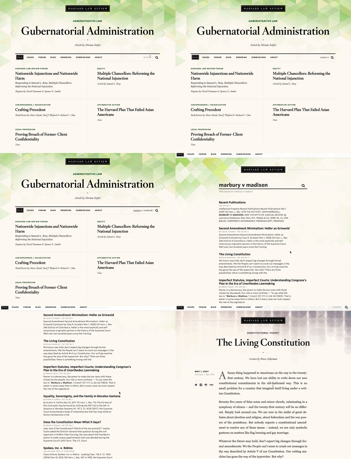
The Harvard Law Review’s home page is clean and well-organized as users can quickly read about recent cases, jump to sections of the website such as the Blog or Forum or enter a specific search. To enter a search query, you can utilize the search box in the navigation bar under the featured article. The HLR’s home page search UI is integrated into the overall design of the page but not too subtlety styled where it would largely go unnoticed.

After you enter a query into the search bar, you are then presented with a simple list of results as well as a count for how many results were returned. If you’d like to enter a new query, you can utilize the search bar which is now positioned at the top center of the page.


8 — PetCareRx Website

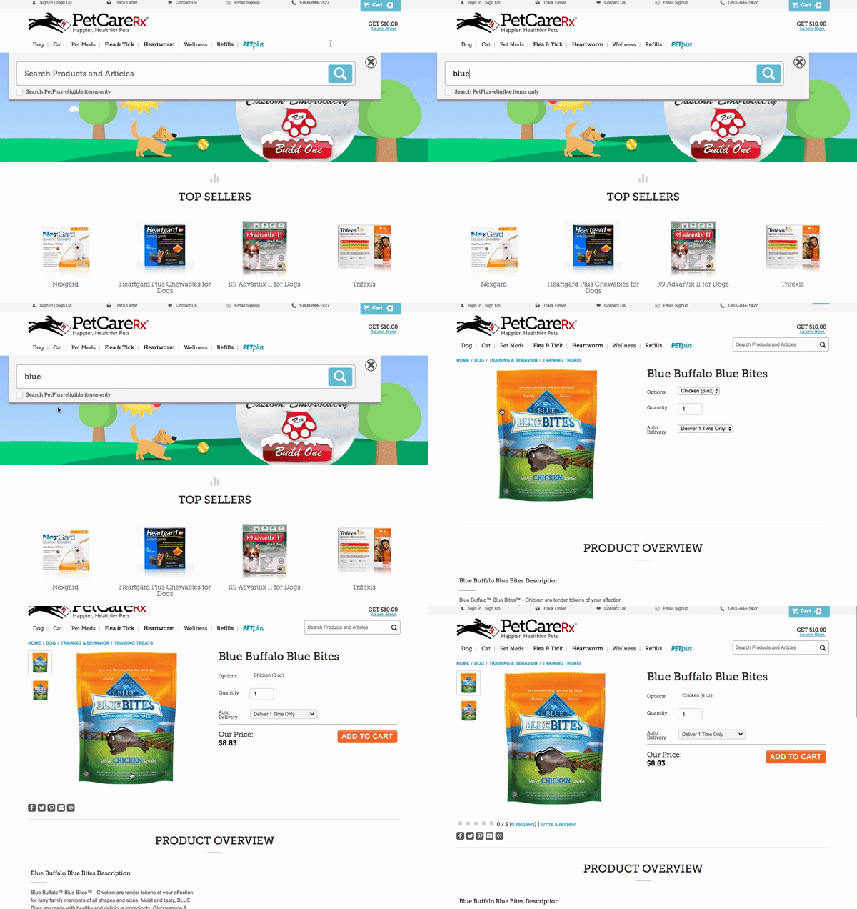
The PetCareRx search bar starts out in the upper right hand corner of the page but expands to the full width of the nav bar when you click on it. Many people come to the PetCareRx store knowing what product or brand they are looking for so search is the ideal interface for them. This partial page search UI has one filter — “Search PetPlus-eligible items only” — which keeps things uncluttered but enables high intent shoppers to get to what they need more quickly.

If you do not select an autocomplete result when you enter a search query, you are brought to a results page where you can apply additional filters like “Category” and “Product Feature”. Below these filters, related search terms are displayed which enable shoppers to easily change their existing search or find additional products.

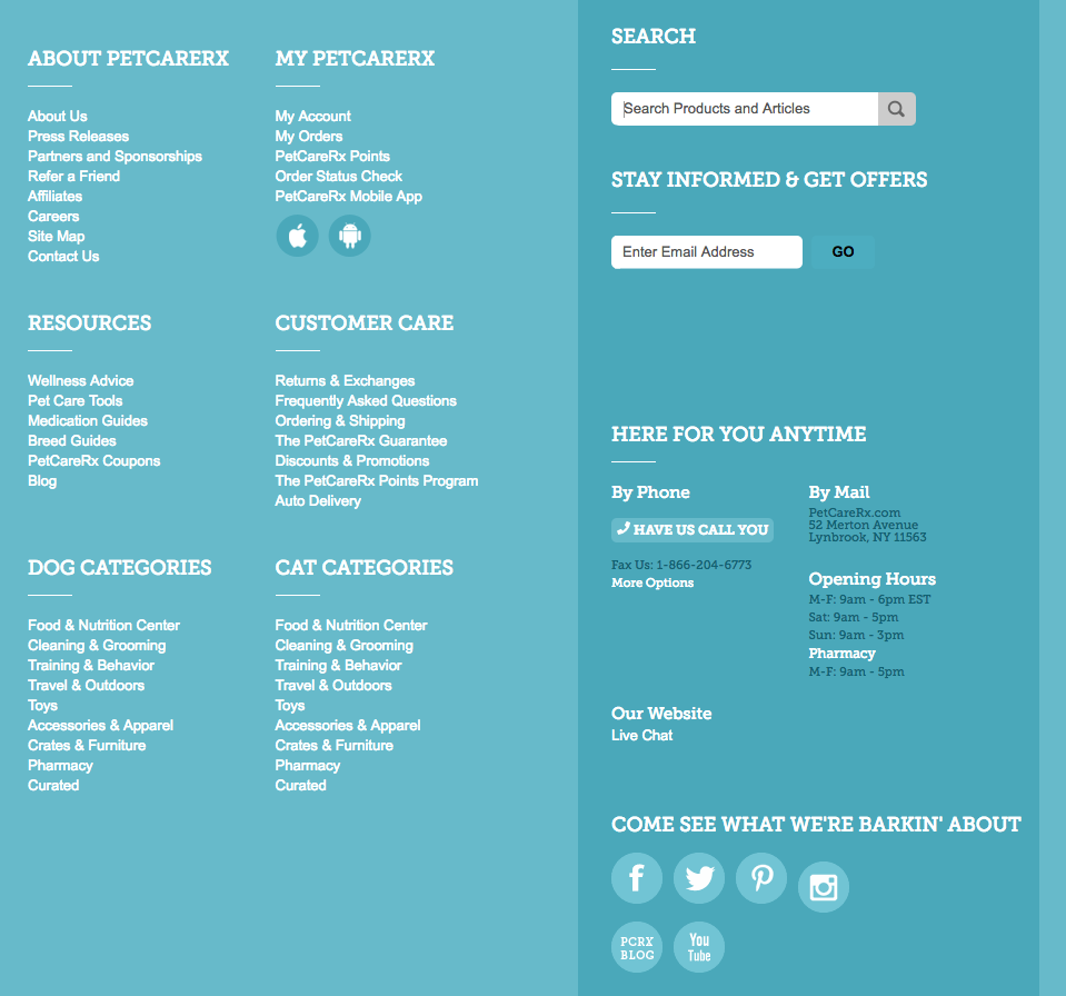
PetCareRx also has a search bar in their large website footer, giving them more opportunity to drive website visitors to content and products that are relevant to them.


9 — Twilio Help Center

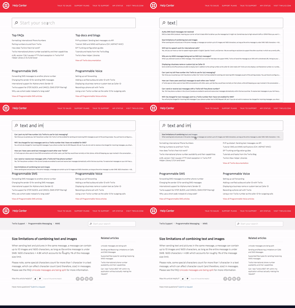
Similar to AppDynamics, Twilio prominently features search in their help center. The grey-bordered search bar extends across the top of the help center right under the red header. Under the search bar, Twilio has listed some popular topics to help guide visitors who do not know exactly what they’re looking for.

As you enter a search query, relevant autocomplete results are displayed. If you do not see what you need in the autocomplete results, you can press enter and be directed to a full results page which will highlight your search term in all of the returned results. To learn more about how Twilio has leveraged search technology to improve their help center and overall customer experience, you can read this case study.


10 — Stitch Fix Men’s Style Guide Website

Stitch Fix’s Style Guide is a strong content marketing website that provides helpful information for both existing customers and potential future customers. Stitch Fix wants to make sure all of their high-quality content is accessible, so they’ve included a search bar on their Style Guide website.

The search bar is in the upper right hand corner of the page and stays fixed there after you enter a search query. As you enter a search term, autocomplete results are displayed but you can also press enter to be displayed a full page of search results. Although search is not a prominent feature of this website, it plays an important role in helping visitors to continue getting value from content when its not featured on the home page.


Implementing your search UI

At Swiftype, we provide powerful search as a service complete with customizable search UIs. We make it easy for you to get a search engine up and running by providing a web crawler and API for ingesting data, an intuitive admin dashboard for managing your search experience, and multiple options for implementing your search UI including our search and autocomplete jQuery libraries. Ready to get started with Swiftype? Sign up for your 14-day free trial here.
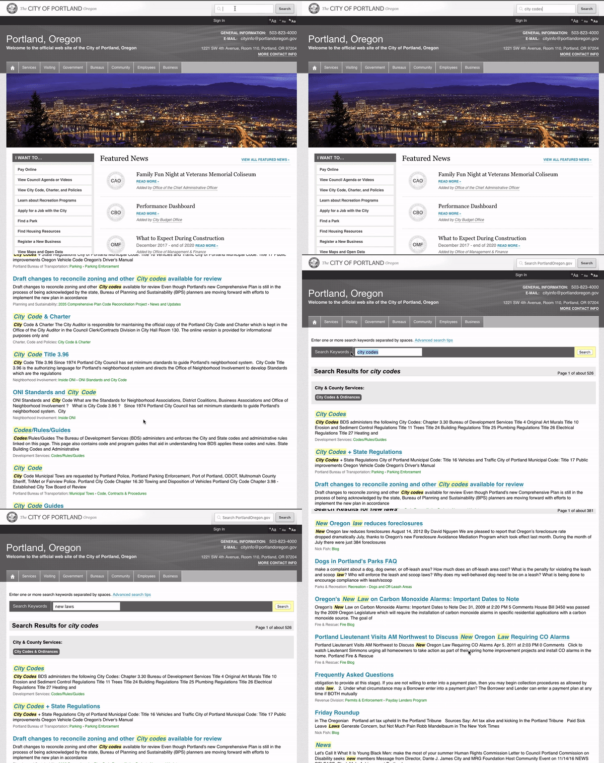
How to Build a Search UI

You need a powerful search backend + a well-designed UI

Depending on the purpose and scale of your website or app, search can be a critical feature that enables your users to quickly find the information they need. While the backend of a search installation is critically important, your users will not be able to get the full benefit of your search engine without an intuitive user interface.

At Swiftype, we provide search as a service to completely handle the backend of your search engine, but we also help you to build well-designed search UIs. In 3 simple steps, you can have a functioning search UI implemented in your website or app. Read on to learn how.

Step 1 — Create a Swiftype account and index your data into Swiftype

We offer a customizable web-based crawler as well as an extensively documented API for indexing your data. If you need to create a Swiftype account, you can do that here.


Step 2 — Customize your search results

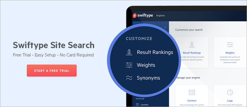
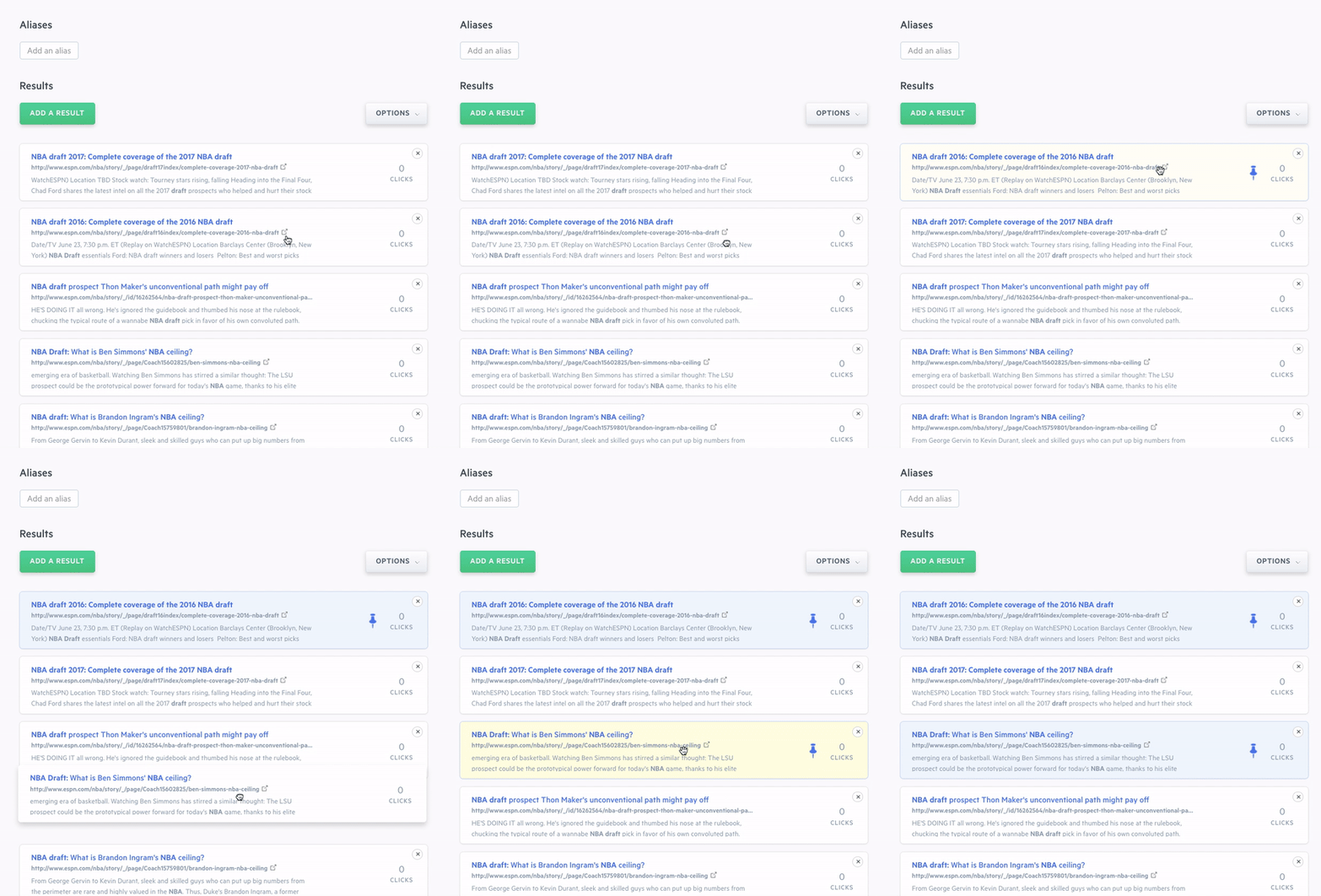
Swiftype enables you to customize search results on a query-by-query basis (result ranking), adjust the weights placed on your data types (weights), and create synonym groups through a dashboard (synonyms). For full programmatic control of your search engine’s relevancy, you can leverage the Swiftype API.


Step 3 — Implement your search bar

How you preform step 3 is determined by whether you used the crawler or API to index your data.

How to implement your search bar if you indexed your data with the crawler:

If you used the Swiftype crawler to index your data, then you can copy the code given to in your Swiftype dashboard and paste it onto your web pages where you want a search bar to appear. As noted in your Swiftype dashboard, if you already have a search bar on your website, you will need to add the class ‘st-default-search-input’ to that input field.

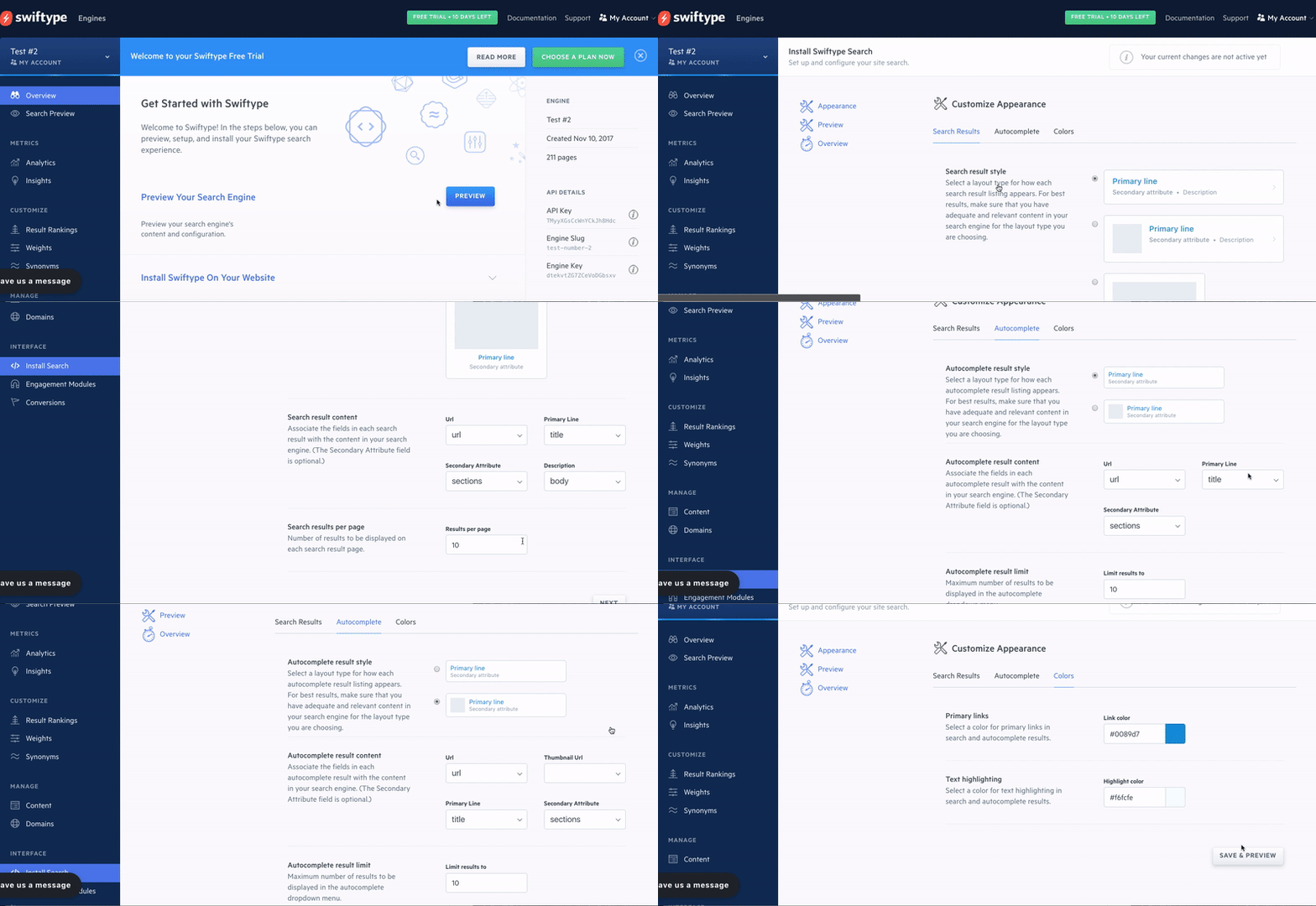
Since you’ll likely want your search UI to match the design of the rest of your website, Swiftype makes it easy to customize the appearance of your search bar and results container. To customize your search installation, simply click the “Edit Install Setup” or “Edit Appearance” cards under the “Customize Your Installation” portion of the Swiftype onboarding flow. You can also access the customization features by clicking the “Install Search” tab on the dark blue side bar.

As you experiment with the look and feel of your search, you can preview your changes in the Swiftype dashboard (before pushing your changes live). For more information on configuring the look and feel of your search engine, check out this video tutorial

Note that you can also customize your Swiftype search bar installation through CSS directly on your web page. Here’s a tutorial that introduces you to customizing Swiftype visual styles with CSS.

How to implement your search bar if you indexed your data with the API:

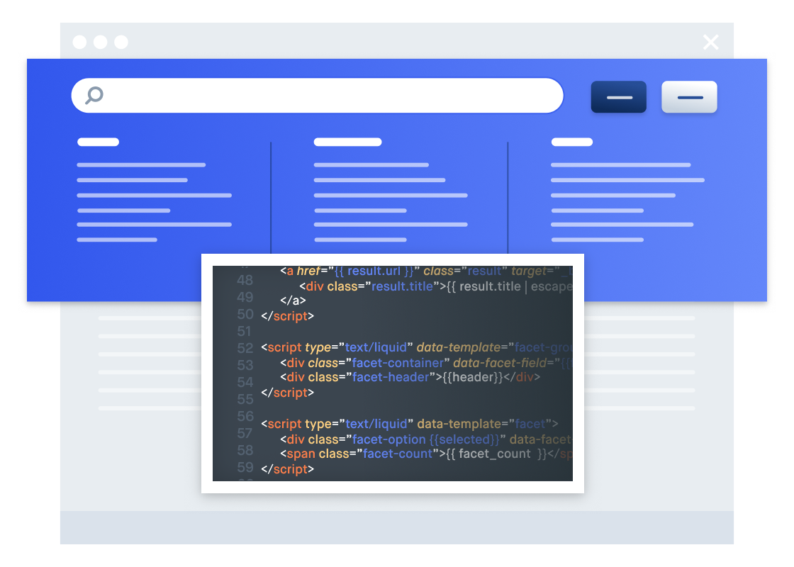
When you use the Swiftype API, the standard embed install code for implementing search on your website is not available because it doesn’t work with custom Document Types. Therefore, you’ll need to implement your search UI using the Swiftype search and/or autocomplete jQuery libraries which are written to be flexible based on your specific use-case. While implementing your search bar with these libraries gives you more control over the look and functionality of your UI, they also require a greater understanding of HTML, CSS, and Javascript.

Let’s walk through implementing your search UI using the autocomplete jQuery library.

Step 1 — Add the Swiftype library code to your codebase. Note that you need to add a Javascript and CSS file (unless you want to write all of your own CSS).

Step 2 — Include the following code in the header of your web pages where you want your search bar to appear. Note that you need to include a reference to the latest version of jQuery.

<script type="text/javascript"src="https://ajax.googleapis.com/ajax/libs/jquery/1.7.1/jquery.min.js"></script>
<script type="text/javascript" src="jquery.swiftype.autocomplete.js"></script>
<link type="text/css" rel="stylesheet" href="autocomplete.css" media="all" />

Step 3 — Add a search input field to your website. If you already have a search input, then add the id ‘st-search-input’ as the input’s id. Your code would look something like this:

<input type='text' id='st-search-input' placeholder='Search' style="width: 300px;"/>

Step 4 — Include a Javascript snippet on pages where you want your Swiftype search engine to work. Keep in mind you will have to use your own Swiftype engine key which you can find on the right side of on the “Overview” tab of the Swiftype Dashboard.

<script>
$('#st-search-input').swiftype({
        engineKey: 'your_engine_key'
});
</script>

Step 5 — Optional: Customize your search queries and how your results are displayed. For example, you can specify a result limit for search queries and explicitly list the fields you want returned for each document type.

Specify a result limit:

<script>
$('#st-search-input').swiftype({ 
	engineKey: 'your_engine_key',
	resultLimit: 20
});
</script>

Fetching only the fields you specify:

<script>
$('#st-search-input').swiftype({ 
	fetchFields: {'books': ['title','genre','published_on']},
	engineKey: 'your_engine_key'
});
</script>

For more information on customizing your search UI with the Swiftype jQuery libraries, see this tutorial. In addition, we have some helpful documentation on the search and autocomplete GitHub pages.

In Review: Getting your search UI to production

How is your search implementation going? Hopefully, you were able to get up and running with Swiftype and implement a beautiful search bar on your website. If you’re struggling to get your search bar set up, feel free to reach out at support at swiftype.com. Happy building!

How to Migrate from Google Site Search to Swiftype

Google Site Search is sunsetting 🌇

As you likely know by now, Google has discontinued the sale/renewal of their Google Site Search (GSS) product. On April 1, 2018 the product will be completely shut down. Since your website will (hopefully) not also be shutting down, it’s about time to replace your GSS with another site search solution.

What about Google Custom Search as a replacement?

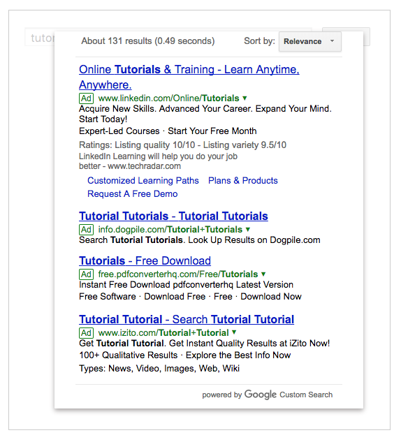
Google plans to keep their Custom Search (CSE) product running so you may be thinking of switching over to that solution. What’s great about CSE is that it’s free. What’s not so great is that ads will show up in the search results and you have little control over the UI. In addition, you will face query limits if your website gets serious traffic and your new content will take a while to be indexed for search.

As Search Engine Land stated in their article covering the sunsetting of GSS, “Google Custom Search is a great solution for small blogs, and maybe even local businesses, but if you’re already scaling on a large level — or plan on advertising at state, country or global level — Google Custom Search will not fit all of your needs.”

How Swiftype Site Search stacks up against GSS

If Google Custom Search doesn’t meet the search needs of your business, then you can easily switch over from GSS to Swiftype Site Search. Swiftype matches GSS’s ease of use, but it offers a far richer feature set, including the ability to customize your search results at a granular level. With the ability to completely control what content is included in your search engine and how it is ranked for search, you can utilize Swiftype to drive visitors to high-value content and impact your bottom line.

Here are some of the powerful features of Swiftype:

Indexing control — Swiftype gives you full control over when your content is visited by our web crawler so your search engine stays up-to-date. With Swiftype you can, on-demand, have us recrawl your entire site, a single URL, or you can just login to our dashboard and delete/edit a page manually.

Customize how Swiftype crawls your content — By default, Swiftype will crawl your entire website (up to page limit of your plan), but we make it easy to exclude or include portions of your site as well as individual web pages. To include/exclude portions of your site, you can use the Swiftype dashboard to whitelist/blacklist certain URLs or set up rules in your robots.txt file. To customize what data from each of your individual web pages is included in your search engine, you can utilize meta tags and body-embedded data attribute tags.

Ranking customization — By default we rank your search results intelligently, but in the end we believe it’s your website, so you should have the final say. We let you add to, remove from, and fully re-order the search results for any keyword on your site, all through our web-based dashboard. You can also adjust the weights placed on your data fields and create synonyms which are groups of terms that are treated equally for the purposes of search (car = vehicle).

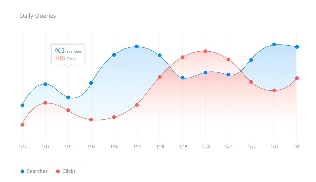
Analytics — We offer a built-in suite of search analytics in our dashboard. These analytics range from simple (e.g. graphing the trend of total searches per day over time), to the more interesting (e.g. “Most popular searches with zero results”). These analytics are collected by default and in real-time, with no additional work needed on your end, and our algorithms use them to automatically improve your search results over time.

Are you a Google Analytics aficionado? Swiftype offers a Google Analytics integration.

Mobile ready — Our JavaScript-based search widgets were built from the ground up to offer a great experience for mobile users, without requiring additional configuration by the site owner. Even on non-mobile optimized sites, once you tap a Swiftype-powered search input, we take over the mobile browser and make sure mobile users get an optimal search experience.

Developer-friendly — Swiftype was designed to be easy to start using, but customizable enough to accommodate the wide variety of Site Search implementations you see on the web. To that end we offer a powerful API and client libraries in many popular languages including Ruby, Python, Node.js, jQuery, Java, iOS, and Android.

For an in-depth view of how Swiftype stacks up against GSS and Custom Search, check out this comparison chart.

How to migrate from GSS to Swiftype Site Search in 4 simple steps

Are you convinced that Swiftype is the next site search solution for you? Here’s how you can get set up. And no, we didn’t forget any steps; it’s really this easy!

  1. Create a Swiftype account — We offer a 14-day free trial so you can really get a feel for Swiftype before committing to anything.
  2. Index your data — As we mentioned in the features overview section, it’s really easy to get your data into your Swiftype search engine. We offer a customizable web-based crawler as well as an extensively documented API for indexing your data. If you’d like some help on getting set up, we offer special GSS migration assistance. You can sign up here.
  3. Customize your search results — Swiftype enables you to customize search results on a query-by-query basis, adjust the weights placed on your data types and create synonym groups. For full programmatic control of your search engine’s relevancy, you can leverage the Swiftype API.
  4. Implement your search UI — Last but certainly not least, you will need to add your new search engine to your website. If you indexed your content using the web crawler, you can simply copy and paste the code given to you in the Swiftype dashboard into your website source code. If you’d like to customize your search UI’s appearance, you can configure the layout and color of your search bar and results directly from the dashboard. For full customization of your search UI, you can use the Swiftype search and autocomplete JQuery libraries.

Ready, set, migrate!

After hearing more about Swiftype’s features and ease of use, are you ready to migrate over? We’ve already helped many organizations including NYU Libraries and the City of Portland switch from GSS to Swiftype. We are happy to provide you with migration assistance so that you can have a quick and easy migration from GSS to Swiftype.

Subscribe to our blog