The Swiftype Blog / Category: Site Search

Top Site Search Questions on Quora

Swiftype on Quora

Quora has your answer

If you aren’t familiar with the question and answer platform that 190 million people visit on a monthly basis, Quora is a question and answer platform that leverages smart algorithms to curate content. It was founded by Adam D’Angelo (former CTO of Facebook) and Charlie Cheever (early Facebook employee) in 2009. Over the past 8 years, it has replaced Yahoo Answers as the go-to platform for Q&A on the internet.

Quora has questions about literally everything, ranging from “What are the 10 best books you’ve ever read?” to “If Google employees were swapped with Microsoft employees, what would happen?” Since we are experts on search here at Swiftype, we’ve taken to Quora to help answer questions about site search and how to do it right. Here’s an overview of what we’ve addressed.

Topic 1 – Google is sunsetting site search

Google is sunsetting their site search by the end of 2017 and is directing users to their ad-powered site search product. This is not an acceptable replacement for businesses, so the search for a new solution is in full-swing.

There are two popular Quora questions on this topic:

Read Matt Riley's answer to Alternatives to Google Custom Search and GSS on Quora

Read Sanjana Chand's answer to Are there site-specific search services similar to Google Site Search? on Quora

Topic 2 – Site search best practices

As search has become a critical component for almost every website or app, webmasters and product builders are seeking to provide the best experience possible. Recently we answered a question on Quora about site search best practices. Since we power search for more than 500,000 websites, we thought we could provide some helpful insight.

Read Sam Reid's answer to What are the best practices for implementing an internal site search? on Quora

Topic 3 – Top site search providers

A popular type of question on Quora is “What is best solution for X?” or “What company does the best job for Y?”. This type of question can be tricky to answer as a representative of a company because answers can come across as biased. At Swiftype, we’ve taken the approach of remaining neutral. When we answer these questions, we focus on objectively highlighting our feature set and the benefits that they provide. Here’s what we had to say.

Read Sam Reid's answer to Who are the best vendors for site search technology? on Quora
Read Praveena Khatri's answer to What is the best site search to implement on a website? on Quora

What are your site search questions?

Do you have a site search question that you’d like us to answer? Post your question on Quora and then tweet at us to let us know (Our handle is @swiftype). We’re happy to share what we’ve learned about search from serving customers like Lyft, Twilio, NBC Universal, Shopify and many others.

Centering Your Website Design Around Site Search


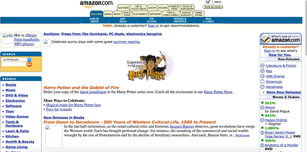
Recently, I took a stroll through The WayBack Machine. Launched in 2001, The WayBack Machine is a digital archive of the World Wide Web, a veritable treasure trove of Internet information and oddities. Trust me when I say you will find some deliciously horrid early attempts at website design and user experience (UX).

Check out this Amazon screen grab from July, 2000. Yeesh, that’s bad.

Today (thankfully!), Amazon’s website looks like this:

And what do you see immediately upon landing on their site? Search. Big, bold. Upfront and up-top.

Considering a website redesign? You need to follow Amazon’s lead, no matter your industry. Here’s why:

The Evolution of Web Surfing

2017 is predicted to see more website traffic than in all other “internet years” combined! Gone are the days when a consumer would tolerate a website as poorly designed and laid out as the early Amazon one above. Today’s consumers want results, and they want them fast. They don’t want to waste time clicking through menus and drop-downs, which is why rich search capabilities are key.

Users today also expect to find easy-to-navigate search functionality on their mobile devices. Sixty five percent of mobile users say that when conducting a search on their smartphones, they look for, and expect, the most relevant information to pop up first.

When you mention search today, people immediately think of Google. But the last thing you want is for frustrated searchers to leave your site and head back to Google. If your search capabilities aren’t up to snuff, they will, and they probably won’t be back.

What Makes a Great Search Interface?

A search box is included in almost every web design, but it’s often overlooked or treated as an afterthought. Search makes it easier for users to find the content they’re looking for, as well as the content you want them to see. The search box’s design should support that exchange, be functional, easy to use, and accessible.

Equally as important, the right software powering your website’s search helps you gather information about your users, such as what product information they search for the most, which keywords or queries they are using, and an overall picture of their needs and their pain points.

Here are the top things to consider when designing and optimizing your website search:

Search Box Placement

Do your site visitors have to waste time searching for your search bar? That’s a big no-no. Position it front and center, and include a text bar and an icon (if possible). The ubiquitous “magnifying glass” icon is a great example. Make sure your “submit” button is big and bold, especially on mobile (avoid “fat thumb” syndrome wherever possible!)—and add your search bar to every page. Don’t hide search anywhere “below the fold” or in a navigation menu.

Search Design

Keep. It. Simple. We can’t stress this enough. Design should focus on the box itself and it should be clear how it functions. At its most basic, it should include a full open text field, title, action button and an obvious search trigger. Usability studies show that it is more user-friendly to not have advanced search options/features displayed by default, as they often only serve to confuse and frustrate users.

Search Functionality

An advanced search algorithm and language modeling functionality are the first things to look for. Your system should intuitively know what consumers are searching for using bigram matching, phrase matching, auto complete, and more. Filters on results page add another layer of functionality to your site search, allowing users to easily drill down to find exactly what they’re looking for.

On the backend, an intelligent site search solution should also have user-friendly dashboards that provide detailed analytics, making it easier for your teams to access—and act upon—the search data collected. A smart software will help you see that pattern so you can immediately update search results to keep visitors on your site—and not bouncing back to Google to find a competitor.

Your solution should allow you to:

  • Customize your search results
  • Add results for popular queries
  • Have the option to promote more relevant content, like higher margin products or the latest news stories
  • Control who can view what information and data
  • Integrate easily with your current tools

Your search bar is an essential tool in your digital toolbox and should be showcased both in design and function. If you would like to learn more about how Swiftype can help supercharge your site search capabilities, we would love to chat!

How to Win at Business With Real-time Search Analytics


Big Data has definitely grown up and shed its “buzzword” status. The fact that Google processes more than five billion searches every 24 hours is just the tip of the iceberg when it comes to the reams of data flying around at any given minute, and it explains why real-time search analytics are rapidly gaining importance.

What exactly is Real-Time Analytics and How Does It Relate to Search?

Real-Time Analytics, at its most basic, is knowing—and acting upon—events happening in your business when they are occurring. In the good old days, consumer data was parsed, processed, stored, and analyzed well after the fact. The data was still good; it was just old.

Couple that with the fact that today’s searchers expect immediate results. They want an organization to be proactive rather than reactive. Real-time search analytics allows you to accomplish that by providing a “real-life/real-time” picture of how your users engage with your site and your site search platform.

And since search is one of the clearest ways to determine exactly what your audience wants, having access to measurable and actionable search data, trends, pain points, or issues—in real time—brings huge value to businesses and drives increased, timely competition. Organizations are able to drive new business opportunities and revenue streams  as well as increase profits, grow customer bases and improve overall customer service. So how do you put real-time search analytics to use?

Ensure the Right Content is Reaching Your Customers

With 200+ million people using ad blockers today, getting your messaging to the right eyeballs has never been more difficult. And as for business decision makers? Eighty percent of them prefer to learn about you via content versus ads. Real-time analytics allows you to immediately track what people are searching, and then identify gaps where users are searching but not finding. This info provides insights around what content you should—and shouldn’t—be creating and shows you immediately if information is resonating (or not).

Track Clickthroughs and Conversions

Any good, real-time site search solution should provide you with analytics to track clickthroughs and conversions. This helps you understand what your users are searching for, clicking on, and engaging with—while they are still on your site—and exactly which of those actions leads to conversions.

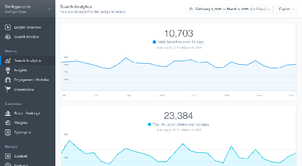
Here at Swiftype, as you can see in the image below, you can also track which autocomplete queries are most popular, and what content was most commonly chosen from the autocomplete suggestions:


Analyze Patterns and Predict Interest

Real-Time Analytics allows you have the data you need, at your fingertips, while those searches, clickthroughs, and conversions are actually happening. This affords you the opportunity to more accurately and rapidly tease out trends, set business goals and benchmarks, and develop laser-focused articles, white papers, eBooks, or case studies. Setting this trend for proactivity rather than reactivity helps businesses stay ahead of the competition.  

There’s a great quote that tradesmen use: “Measure twice, cut once.” Speed is a wonderful thing, but accuracy is even better. And now, with technology, we can have both. Having access to real-time search data not only helps you get the right content in front of the right eyeballs, resulting in satisfied customers and searchers, but it also helps your teams know what content to produce, when to produce it, and why it’s important to customers. The end result? Greater productivity and efficiency, and content creators have the information and guidance they need to get it right the first time.

Learn more about what Swiftype analytics can do by digging in and starting a free trial today.

Great Developers Ship, They Don’t Configure Search


We’re always excited when Swiftype customers give unprompted kudos to our solutions. Of course, we also work with a lot of our customers to showcase how they use Swiftype.

But when someone who’s not a customer writes about how great our products are after a trial, it makes us a bit more proud to be doing what we’re doing. If our products provide such a great experience that someone needs to tell the world, well that just makes us smile!

One recent example is from David Walsh (@davidwalshblog), a Senior Software Engineer and evangelist for Mozilla, who also runs the wildly popular David Walsh Blog. On his blog, which uses WordPress, David defaulted (as many do) to the out-of-the-box search functionality. And, just like many of you, he found it “underwhelming,” so decided to look for a replacement.

You can read his full post here, which goes into much detail on Swiftype’s features, explains how he set up both Swiftype Site Search and Enterprise Search, and offers his overall impressions. (SPOILER ALERT: He loved both of our solutions!)

Reading David’s post inspired me to write this post because it made me realize how web developers struggle to balance the demands of marketers (like me) against the reality of managing a website. Add to that their desire to work smarter and to work on projects they are passionate about, and it’s easy to see how they can become frustrated with things like lackluster search solutions.

As my team and I spend more and more time speaking with developers specifically about search, we’re seeing clear yet unique needs for both public-facing site search and internal enterprise search.

Site Search for Your Public Audience

Engineers and developers want to spend more time developing products and websites, not configuring search. It’s pretty obvious, and understandable. Developing allows them to be creative, solve problems, and build new things. Search, albeit a critical feature for site visitors, is part of a site’s foundation. It should already be there. And it should work, and work well.

Developers are often asked by marketing or others to tweak search results, which should be easy. If you’re not a developer, you probably assume it’s a simple fix. But that’s not the case with most solutions. “Google Webmaster Tools doesn’t allow me to modify result order so I’m somewhat helpless in correcting the issue on Google, but Swiftype allows me to correct the issue for my own site search,” wrote David in his blog post.

Search is not something that can be created or optimized in a few minutes, especially if your search was custom developed. It’s not much better if your search was created by your blog or site platform, or even if it was created by Google. It’s also why few people build their own (read here why building search is so difficult) and why most people default to WordPress’ canned search or Google Site Search.

With Swiftype, however, tweaking search results is easy. We’ve built our solution with developers in mind, and to make their jobs easier. As David puts it, “All I need to do is drag and drop the result and Swiftype remembers the preferred result order.”

Ultimately, what’s most important is the experience you provide to your site’s visitors. Do you want search to be a frustrating part of that experience or a differentiator? Considering that one-third to one-half of site visitors use search, you’re probably going to want to make it great!

Enterprise Search for Your Internal Customers

Internally, developers have more to consider, since search is on the hook for helping every employee work smarter and faster. David goes into great detail in his post, and he points the finger at the proliferation of specialized web services for making enterprise search such a bear. You might be using HipChat or Slack, plus Dropbox and Box, and GitHub and Jira, plus Salesforce and Zendesk. Again, in David’s words, “We have so many focused services now, however, that we run into a frequent problem:  where the hell do we find anything?”

Working smarter means removing the burden of foundational tasks, like API configurations, from the developer’s workload. Swiftype lets you choose from dozens of prebuilt connectors to speed and simplify a holistic enterprise search. If a connector isn’t available, our APIs enable you to create a secure and unique endpoint in just a few clicks. It’s that easy. Developers can even add intranets and cloud-based repositories to their search results pool by using Swiftype’s web crawler feature. It’s all designed to make search easier for developers so they can quickly get back to developing.
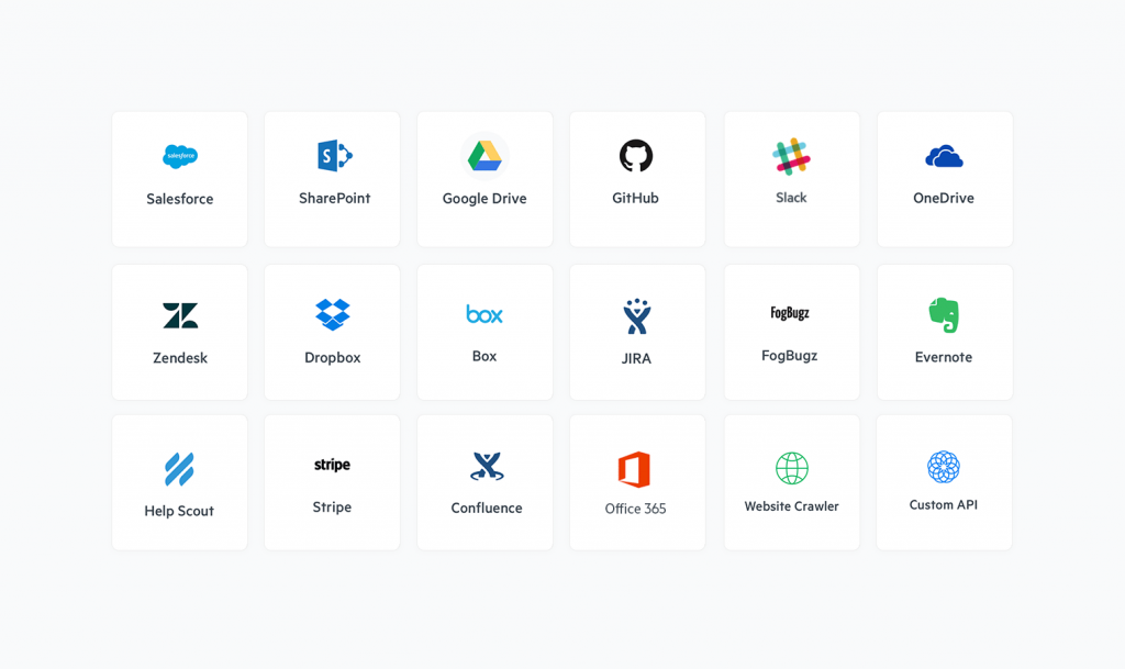
Swiftype's Connector Framework

What’s important here are two things. First, you’re elevating the experience and productivity of your internal customers by helping them quickly find what they need. Second, you’re giving developers more control and more productivity for themselves by making search easier to configure while providing better results.

As David Says, “Give Swiftype a Shot”

I thought about writing a typical marketing “we’re great” conclusion here, but then realized David did a fantastic job of summarizing it on his post:

“Both of Swiftype’s awesome offerings, Site Search and Enterprise Search, are really impressive.  Instead of rolling out your own search or using a lacking free alternative, give Swiftype a shot.”

I couldn’t have said it better myself…so I didn’t!

On the Search: NYU Libraries Implements Swiftype


New York University (NYU) Libraries is a global organization that advances learning, research, and scholarly inquiry in an environment dedicated to the open exchange of information. As the library of a prestigious university in the 21st Century, their proactive focus on technology enables them to actively reach users at their point of need, wherever that may be.

Today, the number one goal in NYU Libraries’ strategic plan is to “create a user experience that is high quality, consistent, and robust regardless of the user’s location, access method, or objective.” Obviously, their website serves as a critical component in reaching that goal.

As head of user experience for NYU’s library division, Nadaleen Tempelman-Kluit manages their online conduit between the university’s vast number of diverse users (from students and faculty to researchers and staff) and the massive amounts of information available. Here, Nadaleen explains their move to Swiftype as their primary site search and how it has improved their user experience.

What prompted you to look for a new site search?

Nyu.edu uses Google Site Search, so we were using that as our library’s site search. We didn’t have a lot of ability to customize the search, so we wanted to move away from that and get our own solution. We wanted to have more control.

What control did you need?

We didn’t have access to the analytics, so we didn’t know what was possible. We didn’t know all of the things we could do until we deployed Swiftype, but before we weren’t customizing anything. We wanted to gather data to improve both the search experience and how we were presenting our content to the users.

Did users notice your lack of customization?

Yes, for sure. We also had the old search kind of buried, so users had a tough time even finding it. But now our [Swiftype] search is front and center across all of our pages because now we understand our users better and recognize what they’re looking for.

How long did it take to implement Swiftype?

It was just a day. We worked with our CMS vendor, Siteleaf, and they recommended Swiftype. So we took their recommendation and it was ready to go almost immediately.

What types of analytics are helping you improve the user experience?

I tend to look at search queries, and that’s been really helpful. Swiftype’s synonym insights are also great. I can look at queries, see what people are searching for and what words they’re using, then add those keywords to our site. That’s been pretty huge.

We have a service called The Avery Fisher Center for Music and Media, where students get DVDs and watch videos, but most people spell it ‘Fischer.’ So there were a ton of people searching for Avery Fischer and not finding anything. That’s a perfect example. Another is a service called E-ZBorrow, which is spelled e-hyphen-z, but people obviously search for “e-a-s-y.” So we put in ‘E-Z’ and the synonyms ‘easy’ and ‘Easy-Borrow’ and so on. That’s been helpful, and it’s a great way to learn your audience.

Where have you seen improvements since deploying Swiftype?

Just looking at the number of searches, it’s much higher than I expected. It’s become very clear that site search is a big deal for our users.

What’s the Swiftype feature you just can’t live without?

The search queries. That sounds basic, but I’m looking for the percentage of people who succeed in finding something. As the head of user experience, that’s incredibly valuable to me. When I see queries where people didn’t find something, I want to jump in and resolve that.

Want to learn more? We have other great stories about how Swiftype has helped other organizations accomplish great things with Site Search. Check it out now!

The Future of Site Search


Last week, we took a look at the future of enterprise search. And we would be remiss if we didn’t set aside the same amount of blog space for a sister post on the future of site search.

Since it popped onto the scene in 1998, Google has pretty much dominated the world of search, including site search. But, as we all know, as of April 2018, Google Site Search will be going the way of the Dodo bird. (Don’t worry—we’re here to help!) And where website owners at one time could access only default site search options with limited capabilities, today, site search has matured lock-step with the rise of high user expectations.

Because searchers today want accurate, rapid-fire results, here at Swiftype our focus has been on building a search platform that is cloud-based, highly customizable (both visually and in terms of the overall results), scalable, engaging, and, of course, mobile. Advanced search algorithms, bigram matching, and features like autocomplete, faceted search, and spelling correction all work together to facilitate those aforementioned speedy search results. But what’s next for site search?

Welcome to the Future of Site Search

The boiled down “why” of site search has always been to have functionality in place that would help searchers tell companies and brands exactly what they were looking for, and/or what their pain points were. And the future of site search is looking very bright indeed.

Mobile Just Keeps Growing: Yes, we know, we know, mobile is the way to go. But seriously…MOBILE IS THE WAY TO GO! Mobile search has grown year over year across most verticals, including the big boys like finance, travel, auto, and media—and that growth is predicted to continue in 2017. The future of mobile search goes beyond simply having a mobile-responsive site. Think fast and efficient user experience, keyword research, content creation, and complex natural language queries. Wearable tech is a hot commodity, with estimates predicting 185 million wearables sold by 2021, resulting in a healthy $16.9 billion industry. And where you have wearables, you have voice search. Voice search continues to grow, especially for all those mobile users who want hands-free, on-the-go convenience. In fact, it’s predicted that by 2020, fully half of all web searches will be conducted by voice.

Artificial Intelligence and Natural Language Processing: Speaking of natural language queries, just as we discussed in our previous piece on the future of enterprise search, AI and NLP are having the same impact on site search, “…creating systems that can identify relationships between search terms and words that pre-defined word/grammar rules-based tools miss. Basically, ‘teaching’ the system how to be human.” And artificial intelligence is becoming so ubiquitous and mainstream, it’s predicted that by the year 2020, 85 percent of a client’s relationship with a business will occur without the need for pesky human beings!  

Visual Search: Another way artificial intelligence is shaping the future of site search is through images. Visual search and Ecommerce are natural best friends, with major brands like Wayfair, Neiman Marcus, Nordstrom, Urban Outfitters, and Home Depot (among others) offering visual search on their mobile sites. But visual search technology does more than just source the latest styles. It helps improves diagnosis accuracy in the healthcare industry and is used in some airports to keep track of how often people change their appearance—frequent changes raise red flags. Pointing your phone at something and hitting search is easy, and site searchers today will always choose easy first. Expect huge future growth for the visual search industry.

Back in 2015, it was said that online search “will be able to see and hear like humans.” Fast forward two short years and it’s safe to say we’re well on our way to hitting those goals. Keep an eye on this space, as the future of site search looks very bright indeed.

Have questions or just want to learn more? The Swiftype Team is more than happy to chat with you about how your organization can ensure site search is a part of your future success. Connect with us today!

10 Ways Publishers Can Optimize Their Websites

We know it happens. Digital Publishing is hectic. You get into the office and are immediately bombarded with an inbox filled to the brim with email, back-to-back morning meetings, coffee with a client, and before you know it – you’ve missed that awesome, educational webinar you had been looking forward to attending all week!

Don’t worry. We’ve got you. 

Well, we’re here to make your day a bit brighter by letting you know that you have a second chance! You still have the opportunity to learn the latest on how you can best optimize your website from Publishing Executive. Joined by speakers Matt Riley, CEO, Swiftype and Sal Fuentes, CEO, Decision Counsel, you’ll get a deep dive on how to leverage different types of data to increase engagement and conversion.  

Once you get readers to your site, holding their attention is the name of the game. Greater engagement leads to devoted audiences, more ad impressions, and readers more likely to sign up for a newsletter, attend an event, or pay for a subscription. From speed and ease of navigation, to site search and content strategy, publishers must stay vigilant in their quest to create sticky, on-site experiences as they vie with platforms like Facebook and Snapchat for consumer attention.

Put your data to work

To refresh your memory, in this webinar we’ll hear how publishers can optimize their sites to meet key business objectives. Some of the tactics to be covered will include:

  • Increasing content engagement & decreasing bounce rate
  • Improving site search & using search metrics
  • Balancing revenue and UX objectives
  • Keeping up to speed on mobile design
  • Using analytics to drive web and content strategy

If you had previously registered, just follow the link below and click “Already Registered?” in the top right-hand corner. If you’re joining for the first time, fill out the standard form and you’ll be taken to the recording as well. Happy learning!


Google Custom Search: You Get What You Pay For

When you meet someone for the first time, you create a first impression within seven seconds. Your website is no exception. Once on your website, your prospects and customers develop and hold on to lasting associations of your company, your brand and your overall credibility. If they experience any trouble finding the information they are looking for, they will abandon their search and potentially take their interest elsewhere.

Because of this, making it easy for visitors to quickly find information is crucial. Your site’s search box remains the most obvious way for visitors to find what they’re seeking. For many, the go-to solution has been the recently-discontinued Google Site Search, which is now transitioning to Google Custom Search Engine (CSE).

You Get What You Pay For

Now, not only do you have to address a potential migration to Google CSE, you’ll also have to consider the impact to visitor experience that comes with this change. It’s your website and your brand. It’s up to you to maintain the integrity of both on behalf of your company, so take a moment to consider these three points before you make the move to CSE:

  • It puts third-party ads on your website
  • It takes away your control of site search results
  • It distracts visitors from your brand and site design

Get all the facts now

Download the full white paper now for all the details on the 3 Reasons Why Google Custom Search Engine Isn’t Worth the Free Price and make sure you’re making a choice that’s right for you and your website visitors.

Mobile Search and the Modern Marketer

“Mobile mobile mobile!” No, this isn’t an episode of The Brady Bunch—it’s the rallying cry of marketers everywhere. Why? Because in 2016, mobile overtook desktop as the primary way users accessed web content. Of course, if you take a look around the next time you’re in a mall, restaurant, on public transit, or attending a sporting event—probably even in your own living room—this won’t come as a huge surprise.

According to a January 2017 report, time spent in mobile applications climbed by 69% in the United States alone. U.S. users spend an incredible five hours each day using apps on their mobile devices, with messaging and social media in particular eating up a large chunk of that time.

Not only are web users mobile and in love with their apps, they also tend to be multi-platform users, switching from desktop to laptop, to tablet, to mobile phones, (which is why omni-channel marketing is so important).  

Problems to Contemplate When Considering Mobile

Clearly, it would behoove most organizations to have mobile marketing—specifically as it relates to mobile search—squarely in their crosshairs. But, like most things in life, mobile isn’t 100% perfect. There are definitely some mobile-specific issues that you need to take into consideration when crafting your mobile strategy.

  • The potential for higher latency. We have all been spoiled by our rapid-fire desktops and having to wait for a site to load turns a lot of visitors off. I can personally attest to the fact that I bounce if something is taking too long to load and I know I’m not alone. In fact, if a page doesn’t load within three seconds… POOF! 53% of mobile site visits are abandoned. And when mobile sites were compared, those that loaded within five seconds (versus as long as 19 seconds) saw increased ad views, had searchers remain on site 70% longer, and decreased bounce rates by 35%.
  • Errant clicks sink ships. Similar to latency issues, you can also blame the desktop for this mobile problem. Instead of mouse clicks, keyboard strokes, and trackpad precision, it’s our clumsy thumbs and fingers poking around mobile sites. Poorly placed banners, ads, or hard-to-find search elements can lead to incorrect clicks, which lead to increased drop-off. The result? You might have just lost an engaged user on your site to your competitor.
  • Search must be simple. While you don’t want to immediately hammer visitors over the head with your search options, you must ensure that your mobile search capabilities are up front and crystal clear. Since real estate on mobile is limited, it’s especially important that the search results that the user wants are at the top of the list—otherwise users will have to scroll, potentially encouraging them to check out other sites. This means autocomplete takes on an even more important responsibility and misspellings still need to lead a user to the right place.

What Marketers Need to Know About Mobile Search

Mobile’s popularity and continued growth has definitely upset the traditional ideological mantra of: “build (and optimize) your website, and they will come.” Today, many companies—including behemoths like Google and Apple—are opting for a mobile-first push when it comes to website design.

The reasons behind a mobile-first strategy are pretty straightforward. Mobile screens (and their functionality) are fundamentally different from desktop screens and their design should reflect that. Add that to that the fact that people tend to browse more on desktops and search more on mobile, and the need for an easy and efficient mobile search experience makes perfect sense.

Also, as mentioned above, people are spoiled these days. Mobile users are highly goal-oriented, want to achieve results quickly and easily, and don’t want to encounter confusing navigation or crowded screens full of touch-sensitive elements. Not surprisingly, according to a report on SearchEngineLand.com, some of the most common (and most annoying) issues for mobile search users hunting content, also happen to match perfectly with these mobile search issues:

  • Content not sized to screen: Scroll scroll scroll.
  • Font size too small: Pinch pinch pinch.
  • Touch elements too close together: Bounce bounce bounce (see above re: errant clicks).

Adapting to the Evolution of Mobile Users

When you add up all the moving parts around mobile search, you wouldn’t be far off the mark to think that mobile hasn’t actually changed search as much as mobile users have changed search. And these days, the user/customer/client holds all the cards. To sum up, you can help mobile users achieve optimum mobile search success in a few ways:

  • If possible, adopt a mobile-first strategy.
  • Ensure that users can search immediately to find the content they are looking for.
  • Implement advanced search functionality like autocomplete, spelling correction, phrase matching, and more.
  • Do as much as you can to reduce latency.
  • Provide highly targeted content so users find what they need as quickly as possible.
  • And remember micro-moments on the user’s journey, like “I want to know, go, do, and buy.”

It’s predicted that customer/user experience will be the top brand differentiator—topping price and product—by the year 2020. If it’s not already, fine-tuning your mobile search experience should be at the top of your priority list.

Ready to take a hard look at your site search solution and how you can improve your mobile and website search? Chat with the Swiftype team today and they can help find the best fit for you.

Site Search: Your Online ROI Answer Button

As a marketer, you’re aware of all the traditional lead generation channels as well as the latest up-and-coming trends. You might even consider yourself an early-adopting, marketing maverick since you’re open to trying the latest technology or strategies that give your campaigns some edge. But with all the options out there, nothing beats the black and white facts of customer need and intent.

Your website’s search box is the ultimate window to your customer’s intentions. When a visitor takes the effort to go to your website or application’s search box and enter in a search term, it reveals not just what they’re looking for, but a higher level of interest and willingness to take action. These queries can also reveal important information about what content you’re missing or synonymous terms you should be adopting to ensure your visitors are getting the most relevant content.

Site search and search data are important and valuable components of your website, and yet, many companies don’t optimize, test, or reassess their site search at all. This is a major missed opportunity for any marketer.

Don’t miss this chance

Join us on Wednesday, May 24th for a live webinar featuring Praveena Khatri, Vice President of Marketing at Swiftype, Lukasz Zelezny, Head of Organic Acquisition at uSwitch.com, and Thorin McGee, Editor in Chief/Content Director at Target Marketing to learn how you can make the most of your own site search.

  • Mine your search for lead generation and SEO insights
  • Test and optimize your site search function
  • Convert more site search users into buyers
  • And more!

Register and save your spot today!

Subscribe to our blog